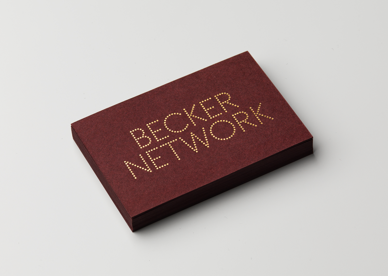
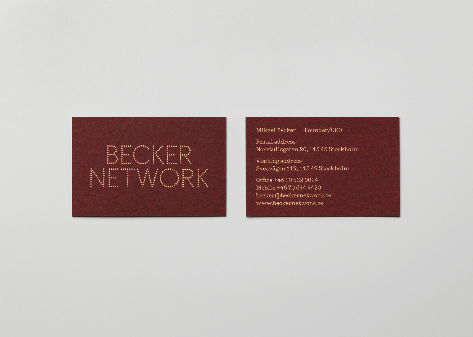
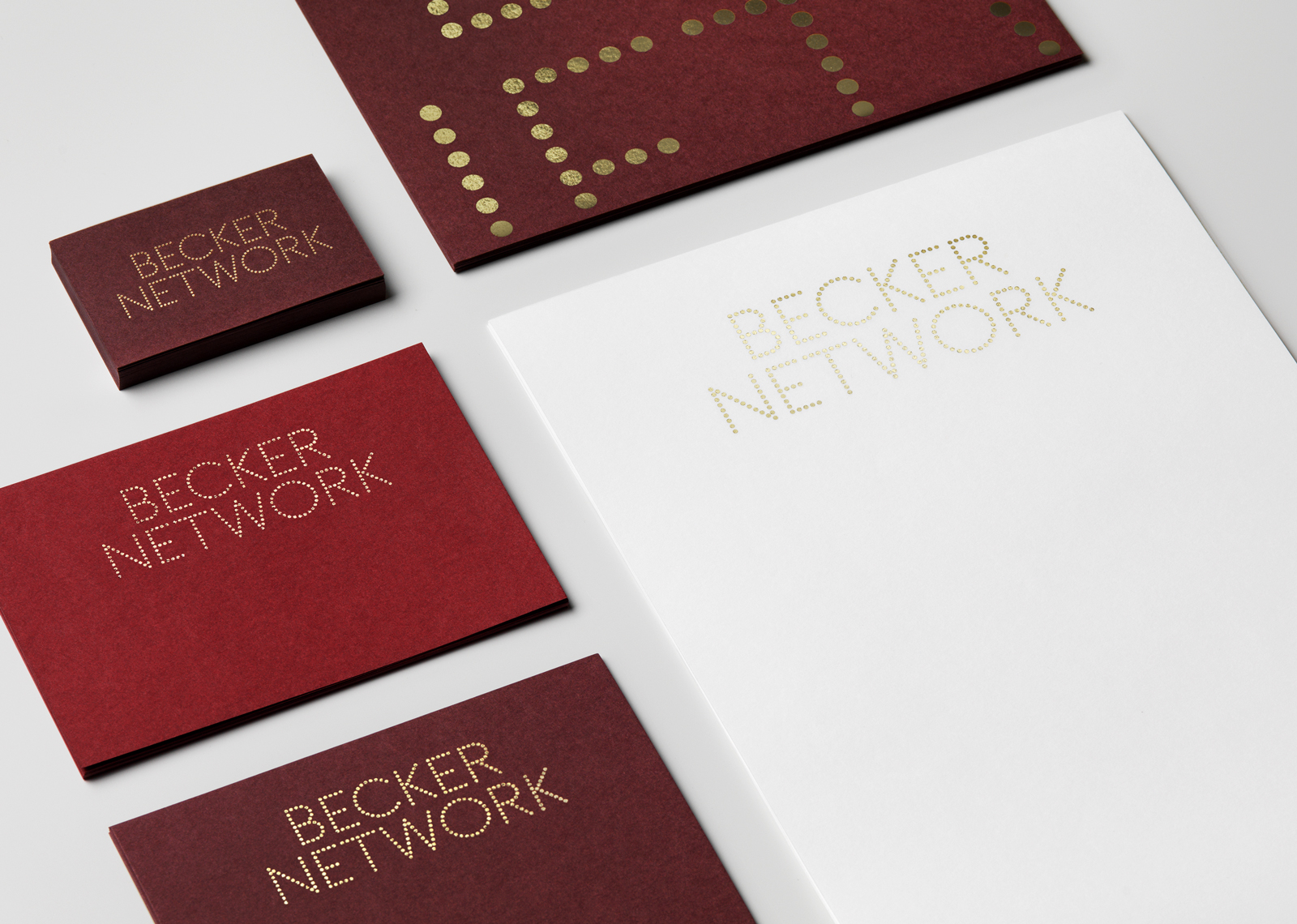
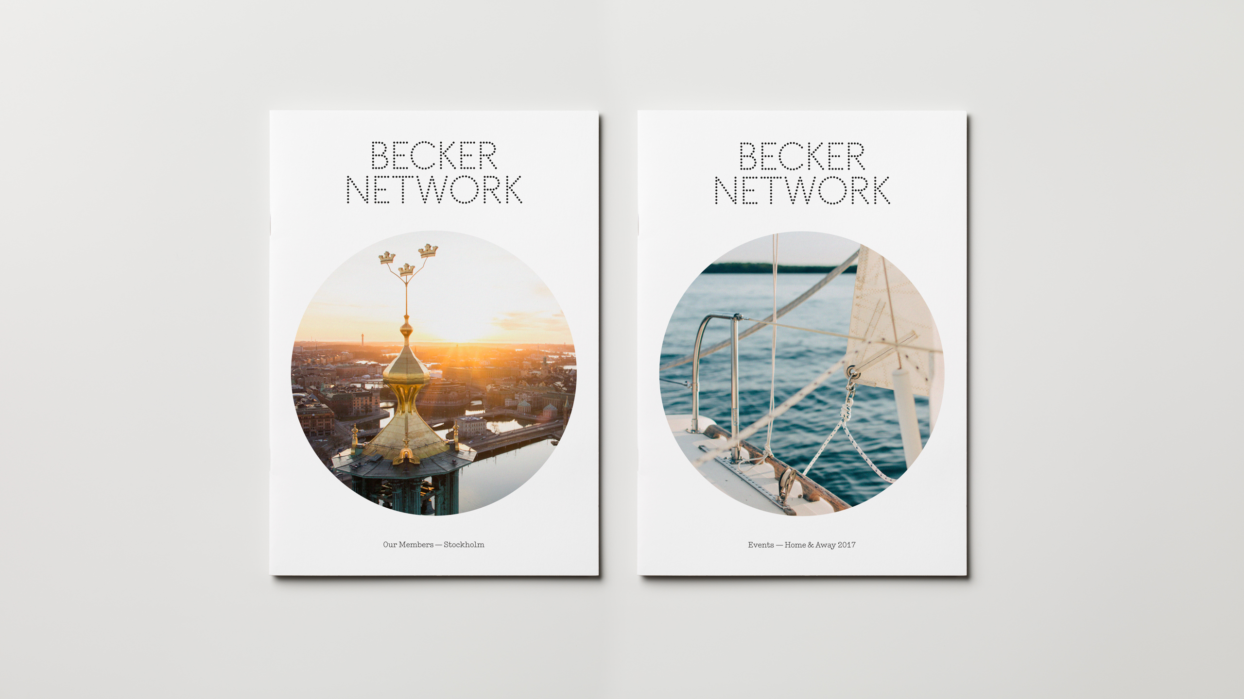
Becker Network
Becker Network is one of Sweden’s most exclusive business networks, and probably the most friendly and intimate one. It has only 100 members, no more, no less, and is based on the idea that there should be only one member company from any given industry. Becker Network promotes business between members, and it does so by arranging frequent activities, trips, lectures, golf tournaments and social gatherings. Founder Mikael Becker was formerly a well-known nightlife profile in Stockholm and the owner of several famous clubs. When The Studio was brought in to redesign the Becker Network identity, this glamorous past became an obvious place to start.
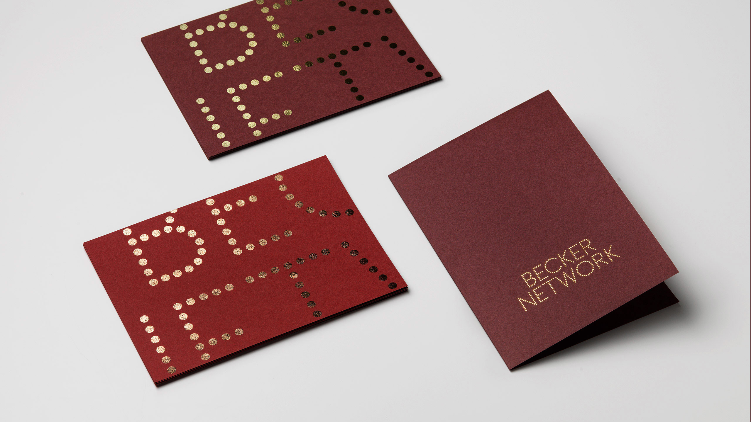
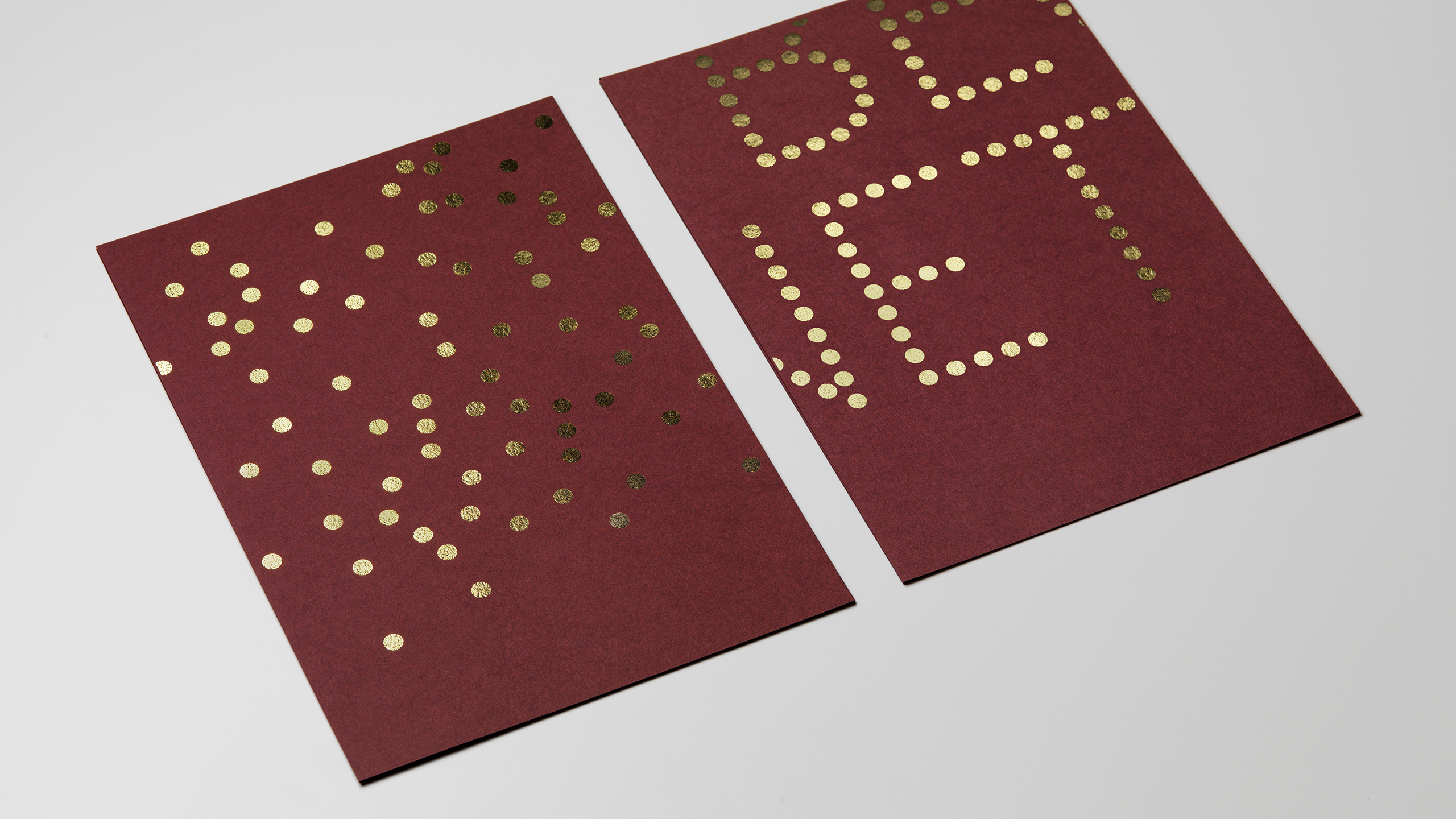
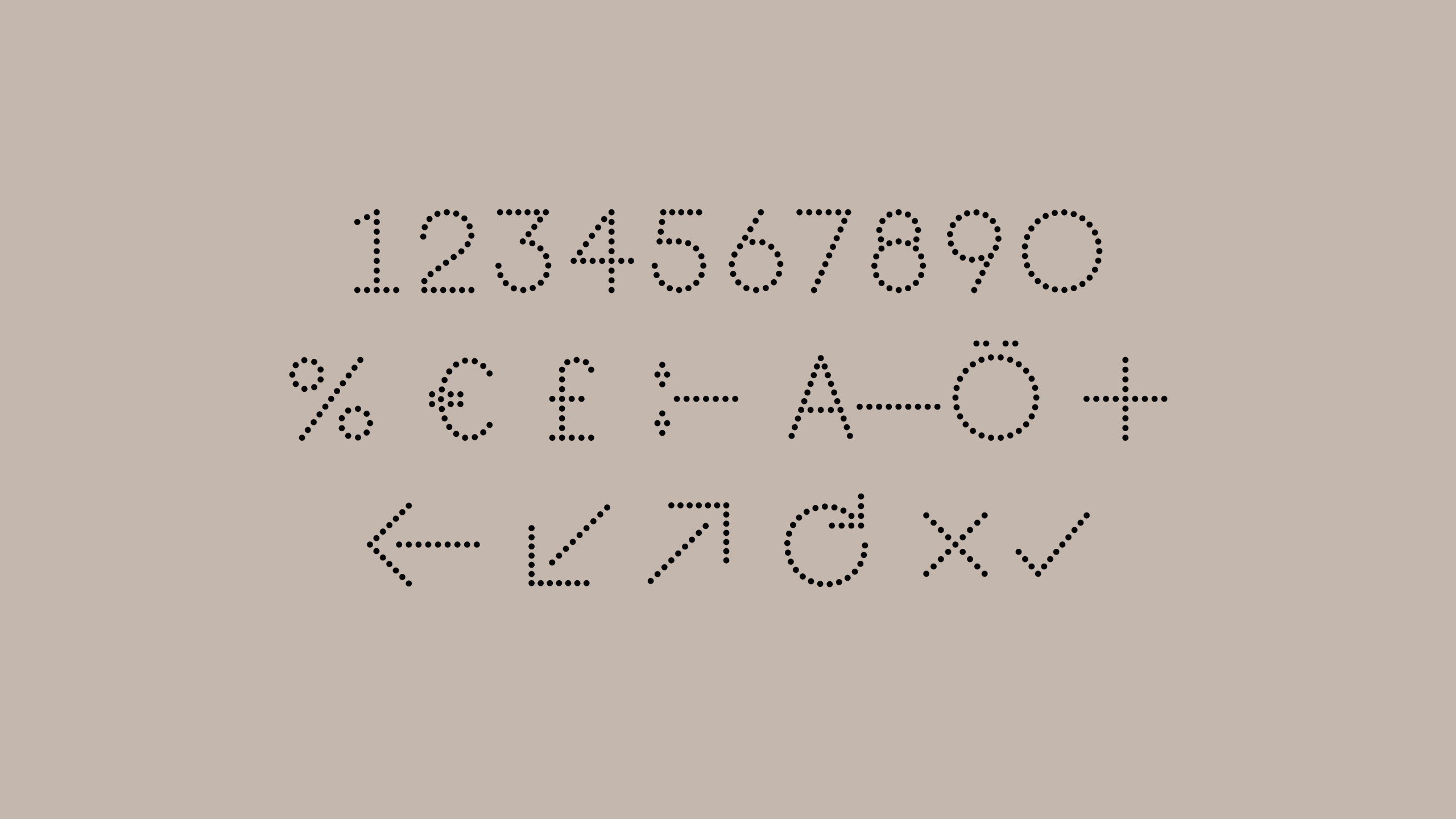
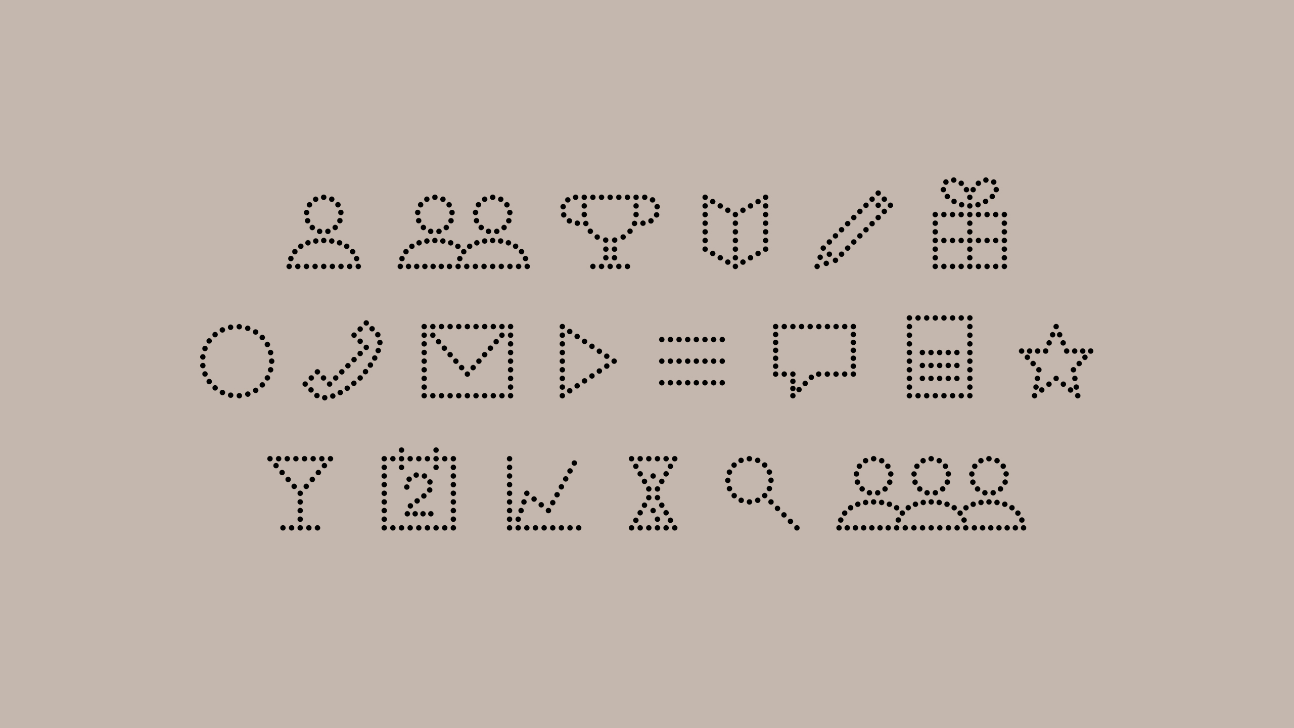
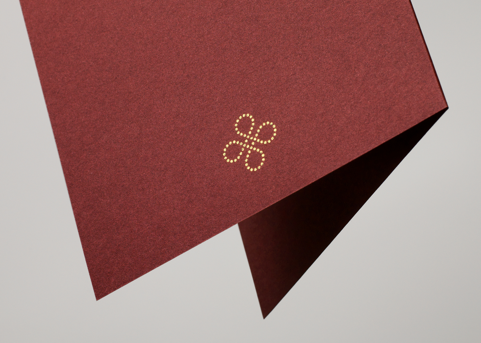
The identity is made up of dots, representing the different members, but at the same time they are also a subtle hint at luminous neon lights. This is further emphasized by using shiny gold foil in print. The dots can be made to form pictograms and symbols, and can be used big and small, as frames for imagery, objects or installations.