Refreshing an iconic brand
The strategy was not to reinvent Blossa Glögg, but to rediscover the heart of the brand and create a design that is contemporary whilst letting the heritage shine through.
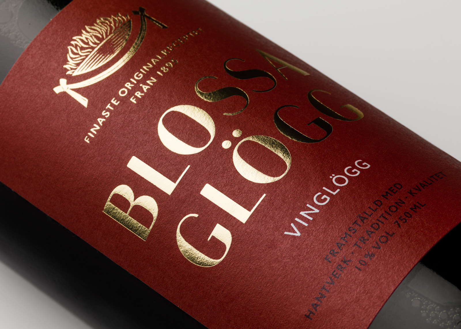
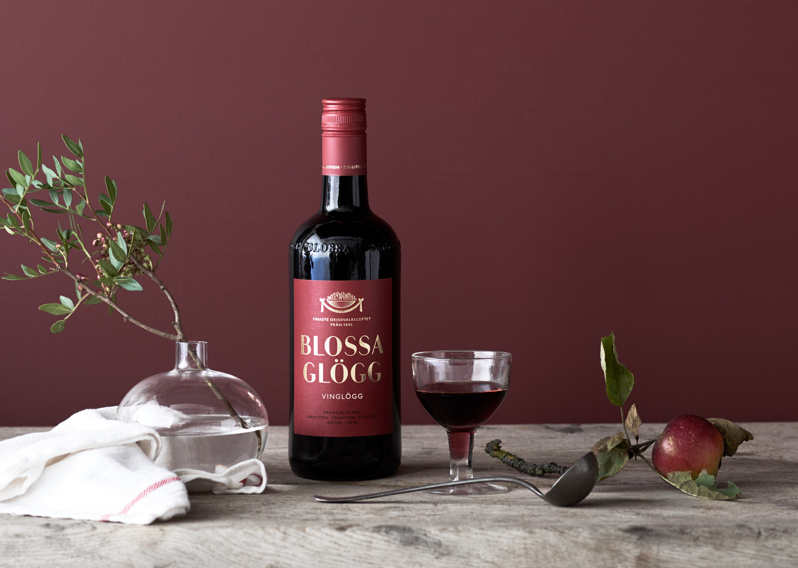
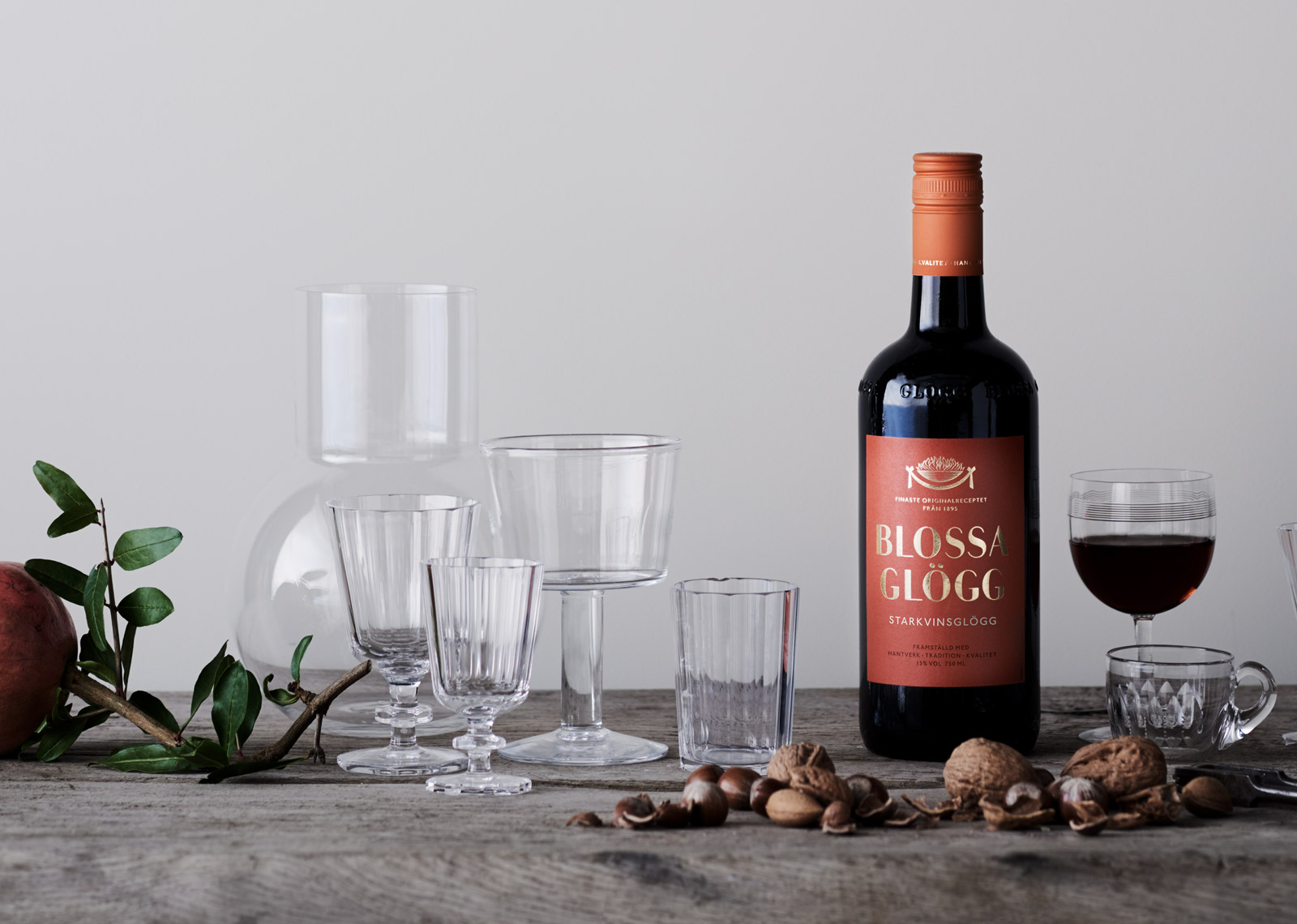
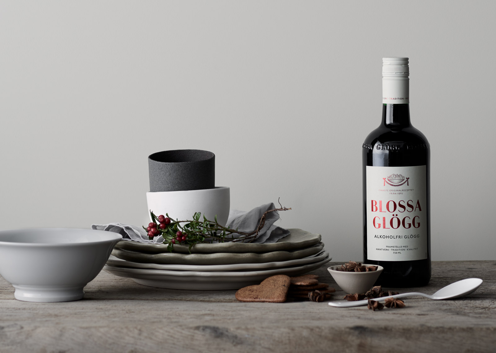
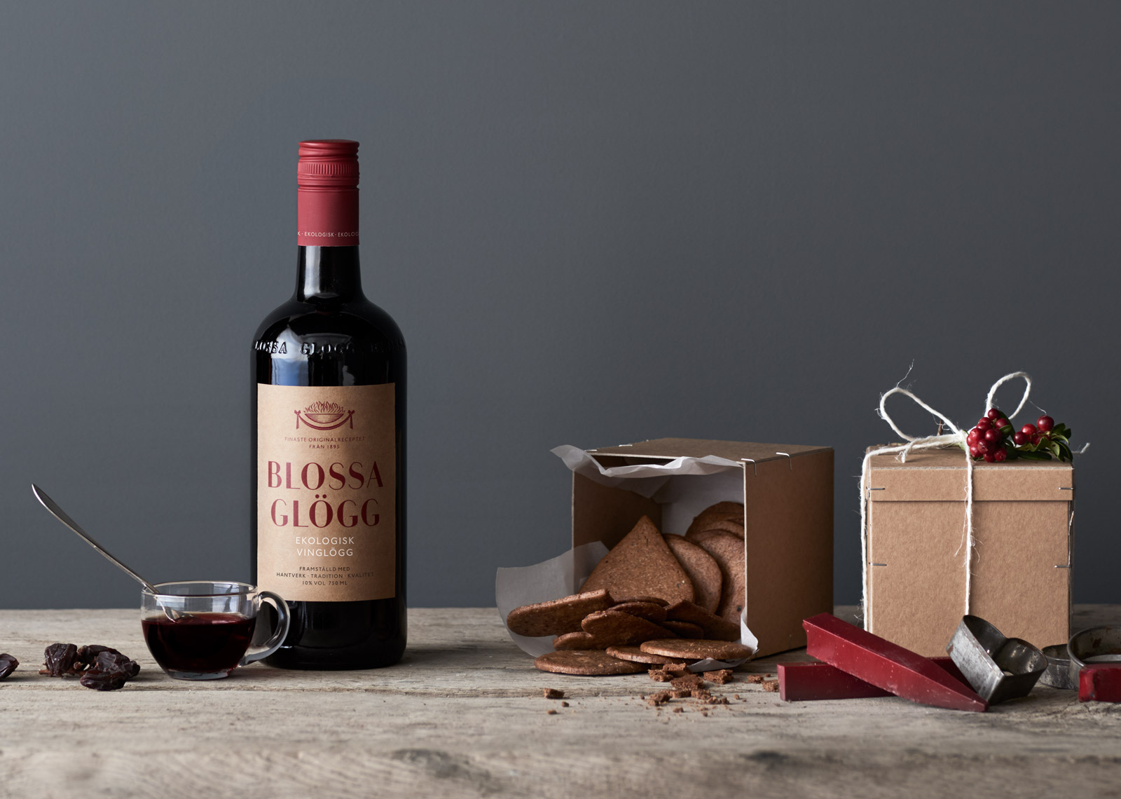
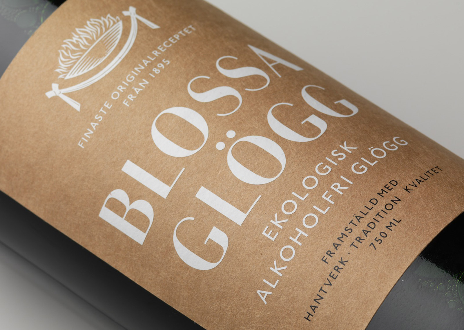
The physical product experience was enhanced by using a quality matte paper giving the labels a tactile, authentic feeling, while the gold foil stamping adds luxury and festivity.
“It feels like Blossa has finally come into it’s own. The new design communicates quality, craftsmanship and tradition at the same time as it is modern and forward-thinking. It’s exactly what we want Blossa to be!” Nathalie Mallédant, Regional Brand Development Manager, Altia.
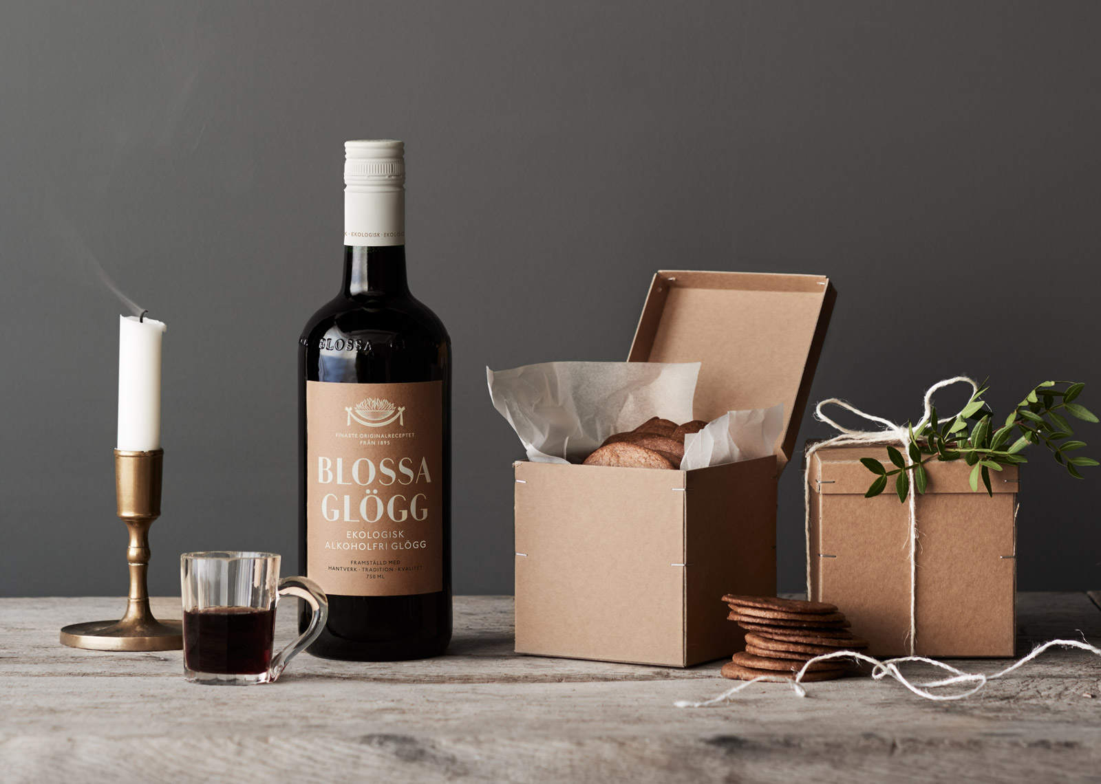
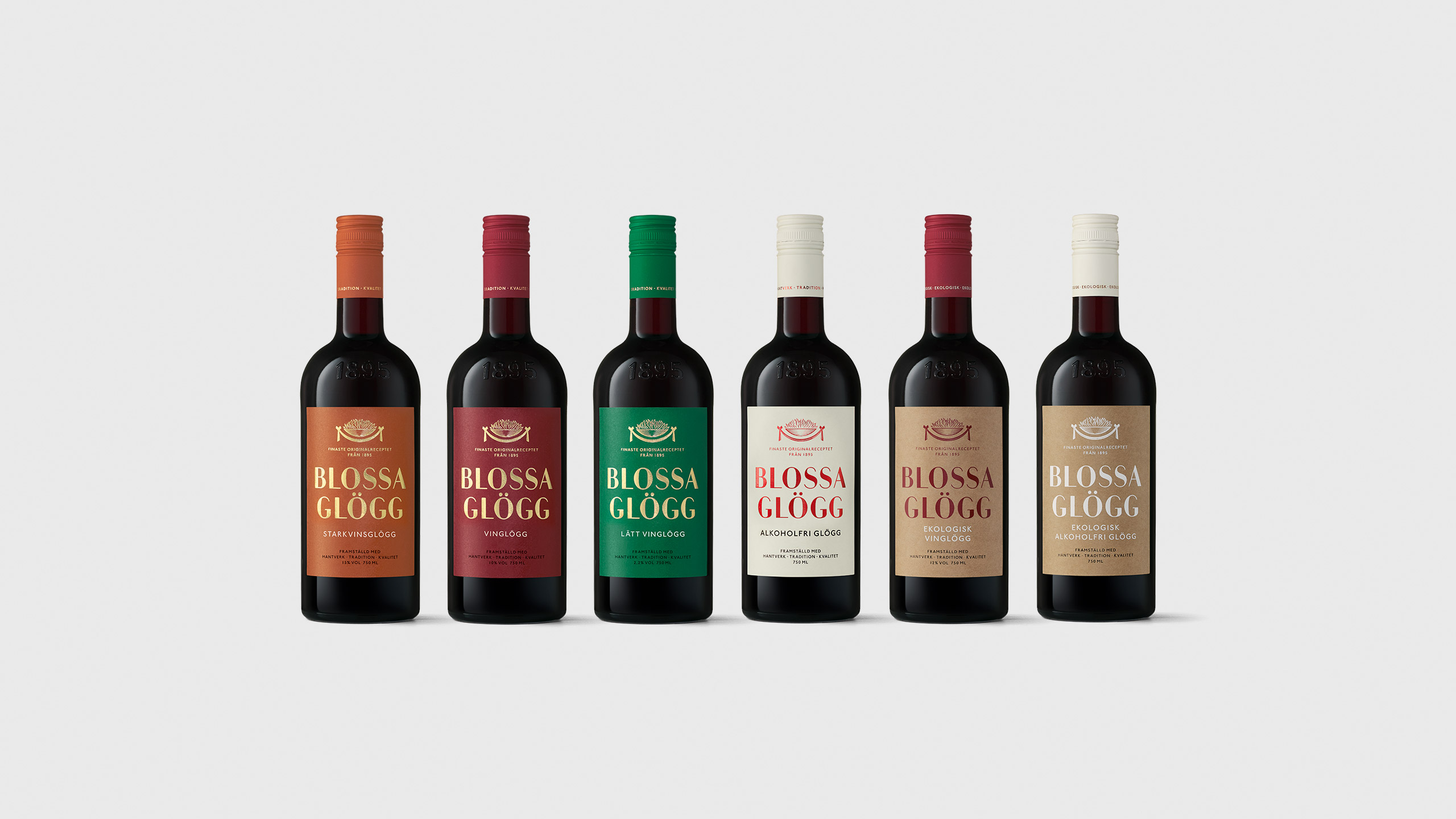
The organic line extension can be recognised through the natural kraft labels.
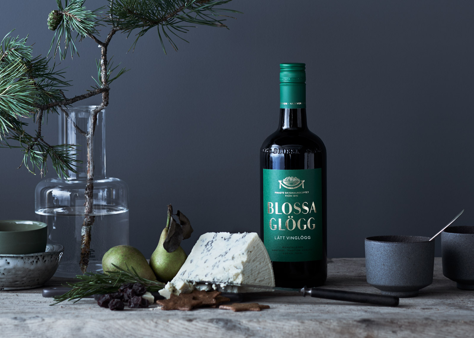
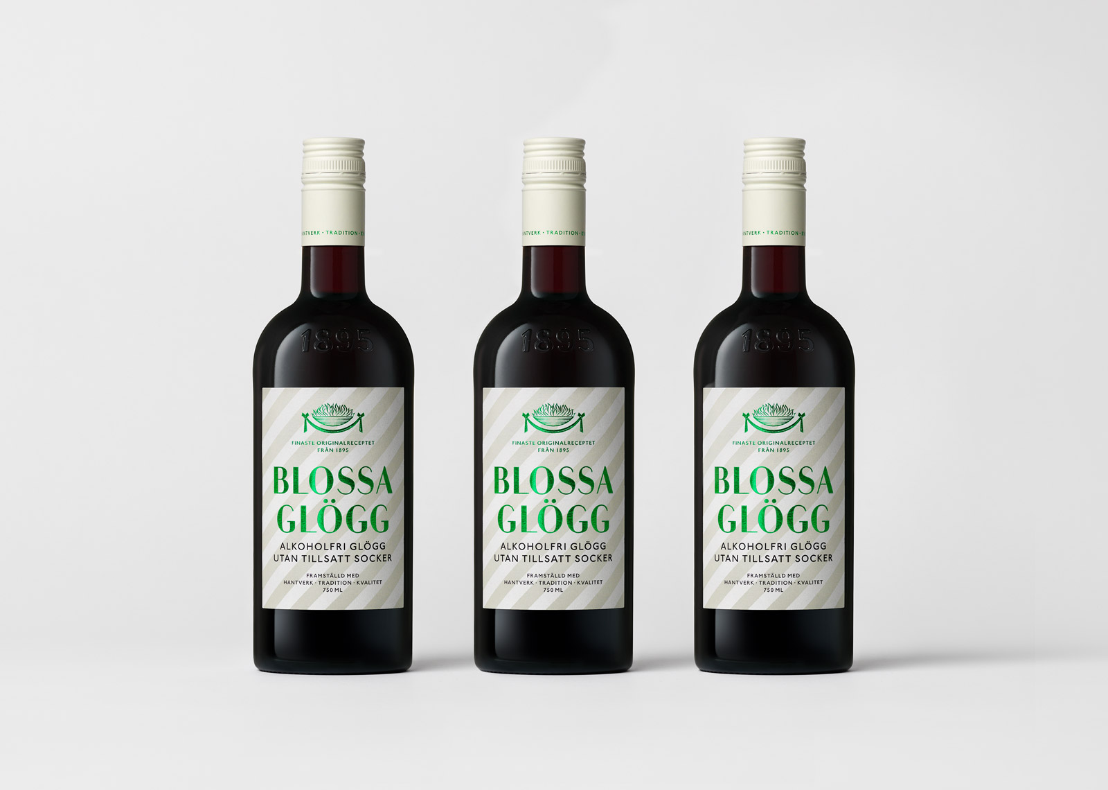
In 2019 Blossa introduces a drier tasting mulled wine variety to the range, naturally sweetened with Stevia. Striped labels in creme tones in to the white non-alcoholic coding, while green foil indicates the natural sweetener.

Blossa Glögg
For over a century Blossa has dominated the market for glögg, a mulled wine that is essential to Christmas festivities in Scandinavia. While the product is dormant for ten months of the year, more than 10 million bottles are sold during the eight weeks leading up to the holidays.
Blossa is still based on the original recipe from 1895. It is composed of quality wines and spices, and the blending process is handcrafted despite the large scale production. This uncompromising approach to quality raw materials, handling, maturing and blending is at the very core of the Blossa brand, and is what has made it so cherished by Scandinavian glögg drinkers for over a century. Blossa has more than 70% share of the market today.
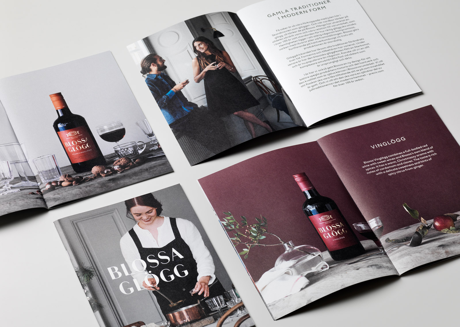
When The Studio was given the task of redesigning the identity and packaging design for the Blossa range, the ambition was to underline those inherent values of craftmanship, quality and tradition. As well as enhance the premium expression, deserving of such a market leader. The strategy was not to reinvent Blossa, but to rediscover the heart of the brand and develop a design that is contemporary whilst letting the heritage shine through. This was done by bringing forth some of the original attributes from Blossa’s early history and incorporating them into the design in a new way.
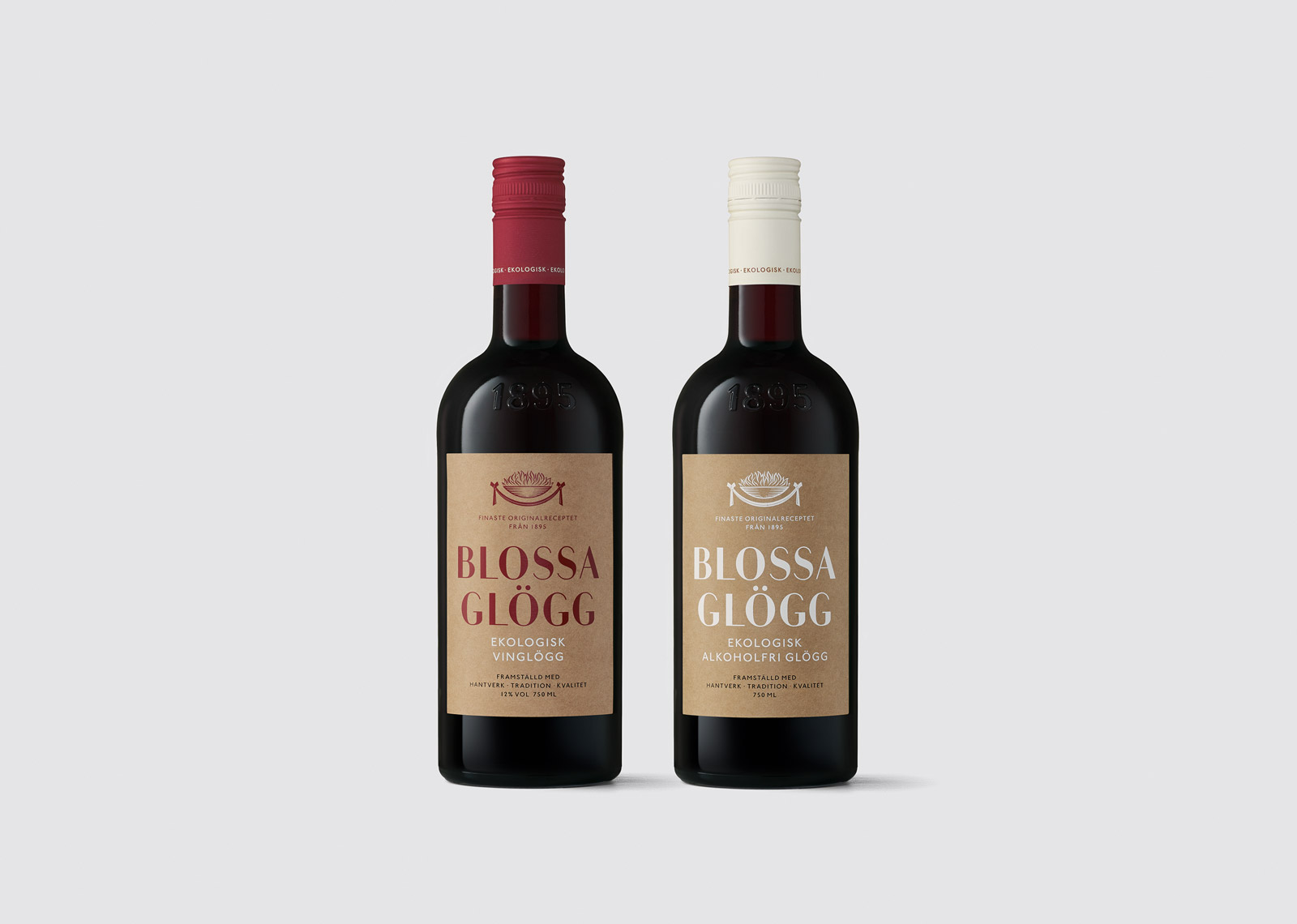
The logotype was crafted based on the original wordmark, refining it and removing the serifs. The classic yet eternally modern sans serif typeface Johnston was selected for headlines and body copy. An emblem used in earlier days on the labels, a brazier, was brought back and refined with the help of engraver Martin Mörck. The classic colour coding system that indicates the different variants was developed and given more prominence.
The physical product experience was enhanced by using a quality matte paper giving the labels a tactile, authentic feeling, while the gold foil stamping adds luxury and festivity. The Blossa Glögg product range consists of six key products, as well as the newly added organic variants of two flavours.
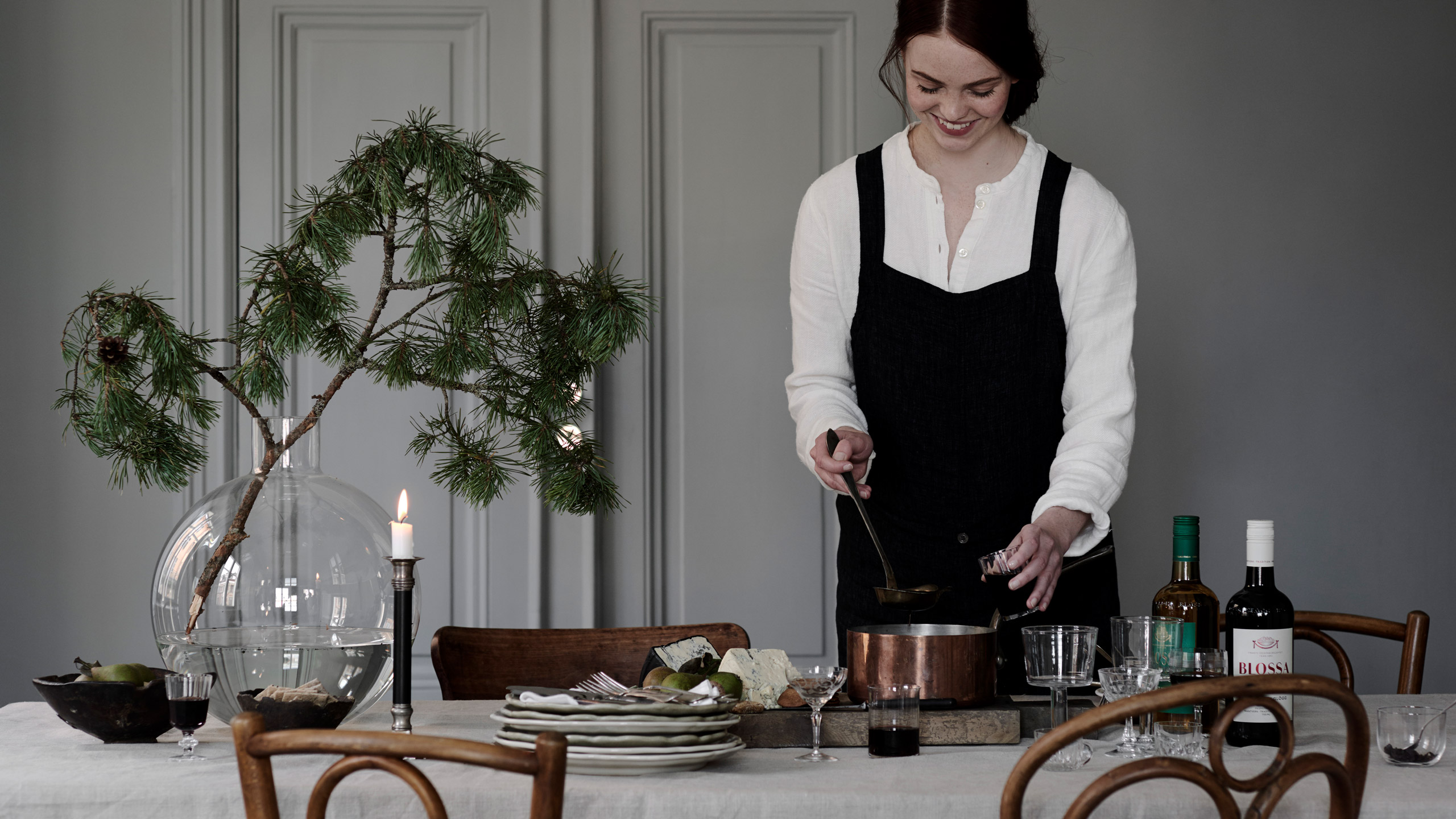
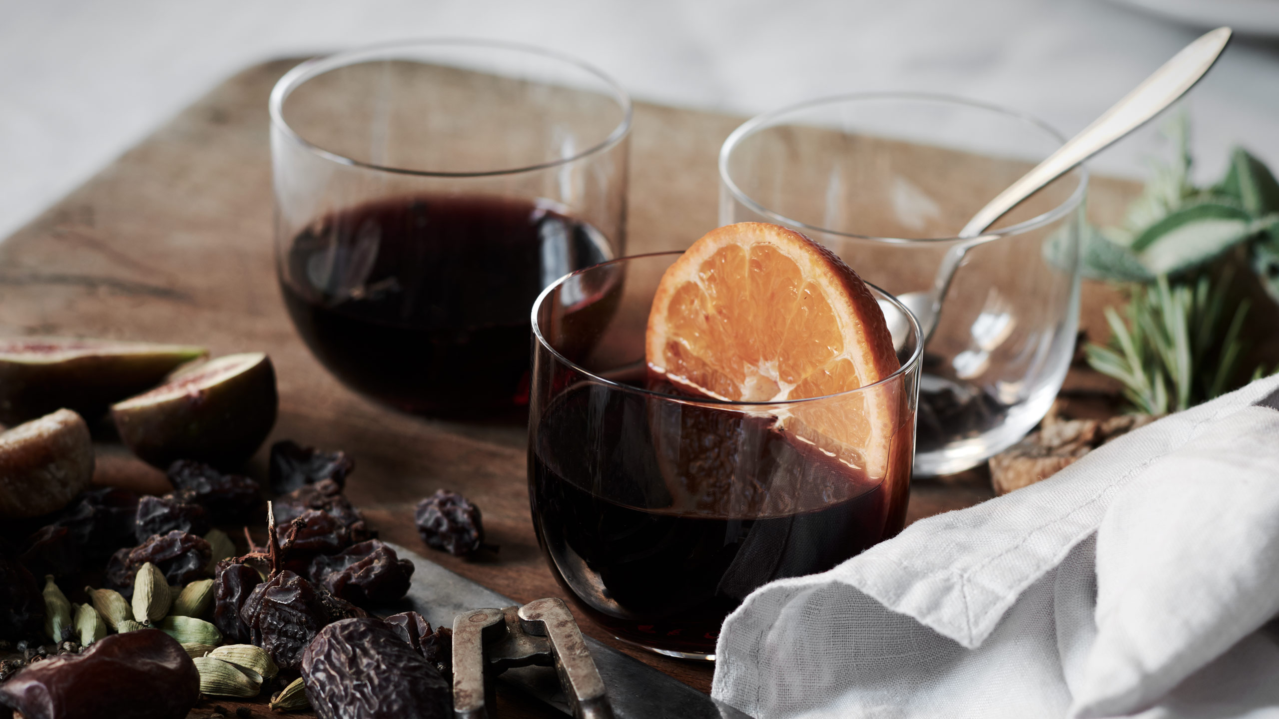
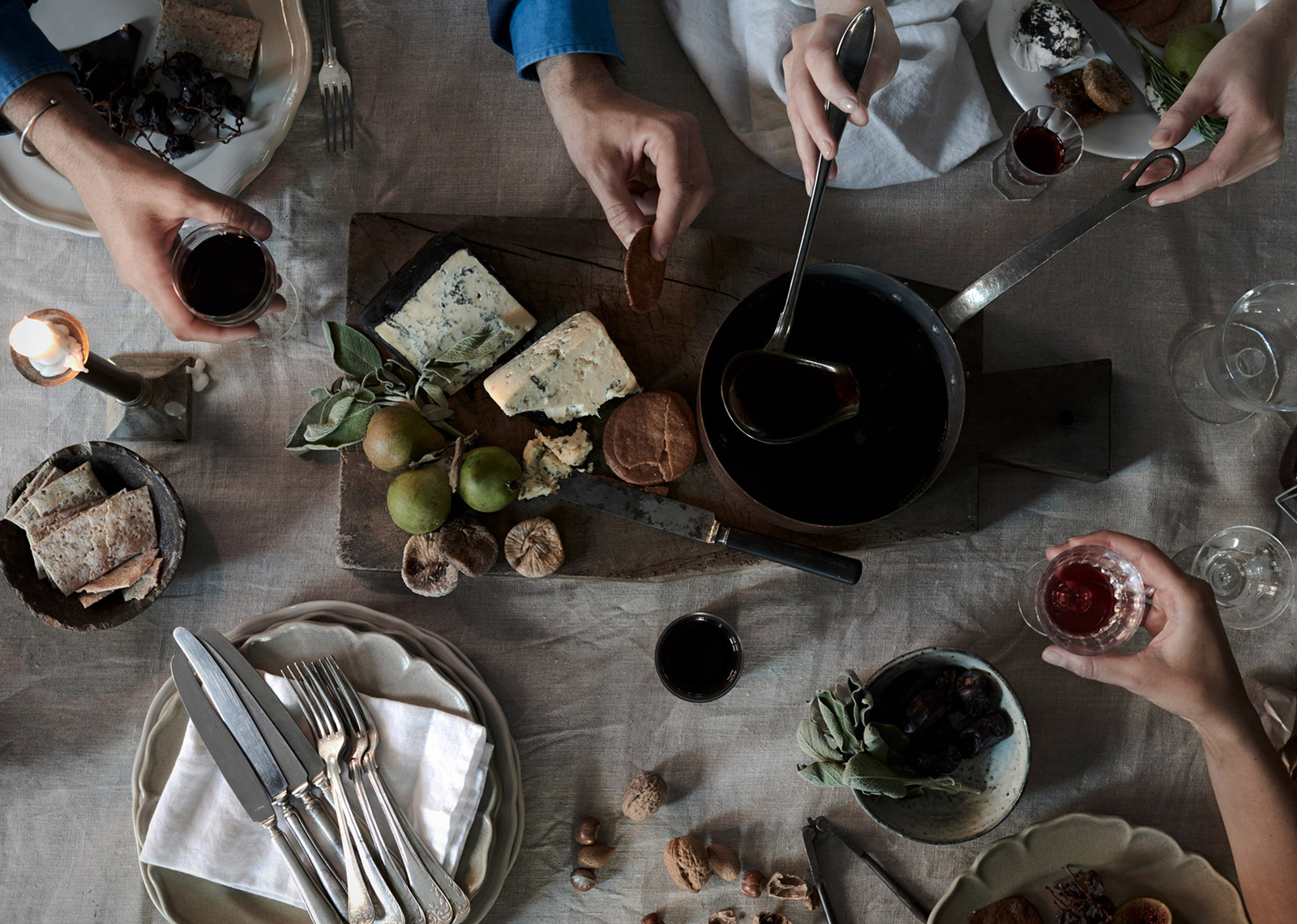
The launch for the new packaging was further enhanced through the art direction of brand images, styled by Lotta Agaton and photographed by Pia Ulin to bring the Blossa brand into a contemporary context.
Photography: Pia Ulin
Stylist: Lotta Agaton
Case photography: Patrik Lindell