Brobygrafiska
Brobygrafiska is one of Sweden’s leading graphic design schools, situated in the quaint town of Sunne in western Sweden. Despite its remote location, the school has the most highly developed print and production facilities of any school in northern Europe. The Studio was asked to help when Brobygrafiska needed an identity redesign that would be better aligned with the school’s mission and match its excellent reputation.
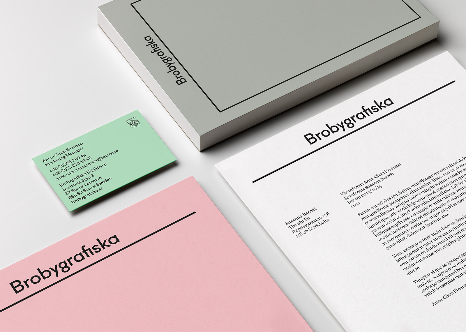
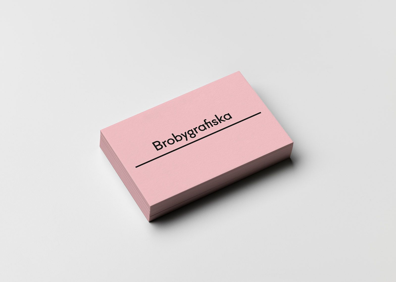
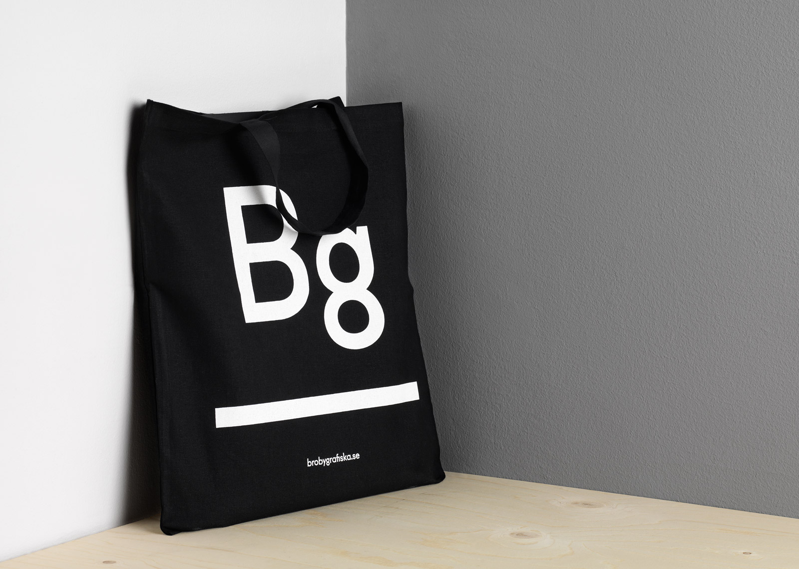
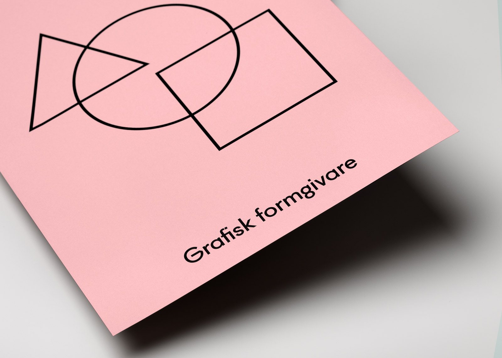
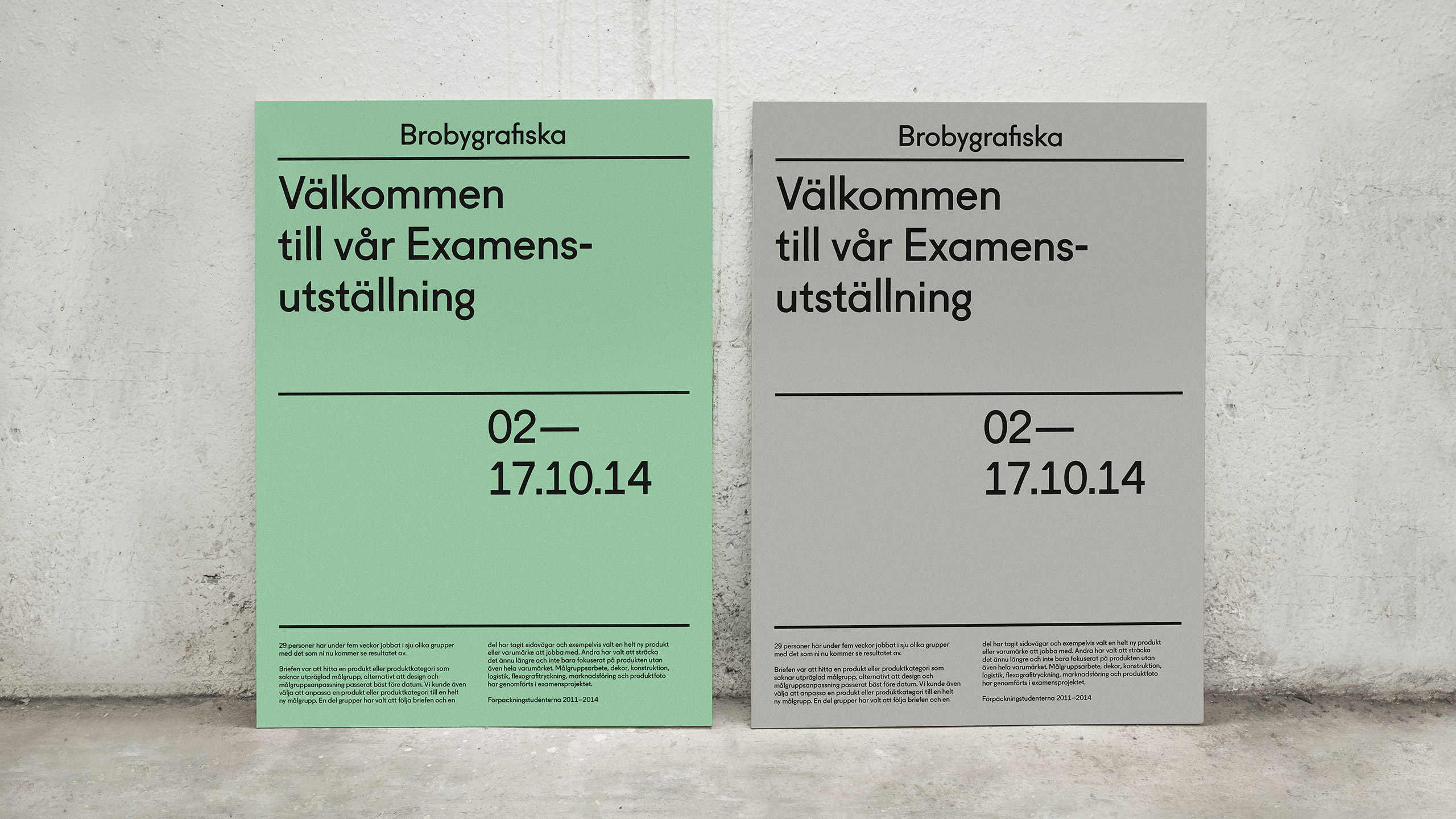
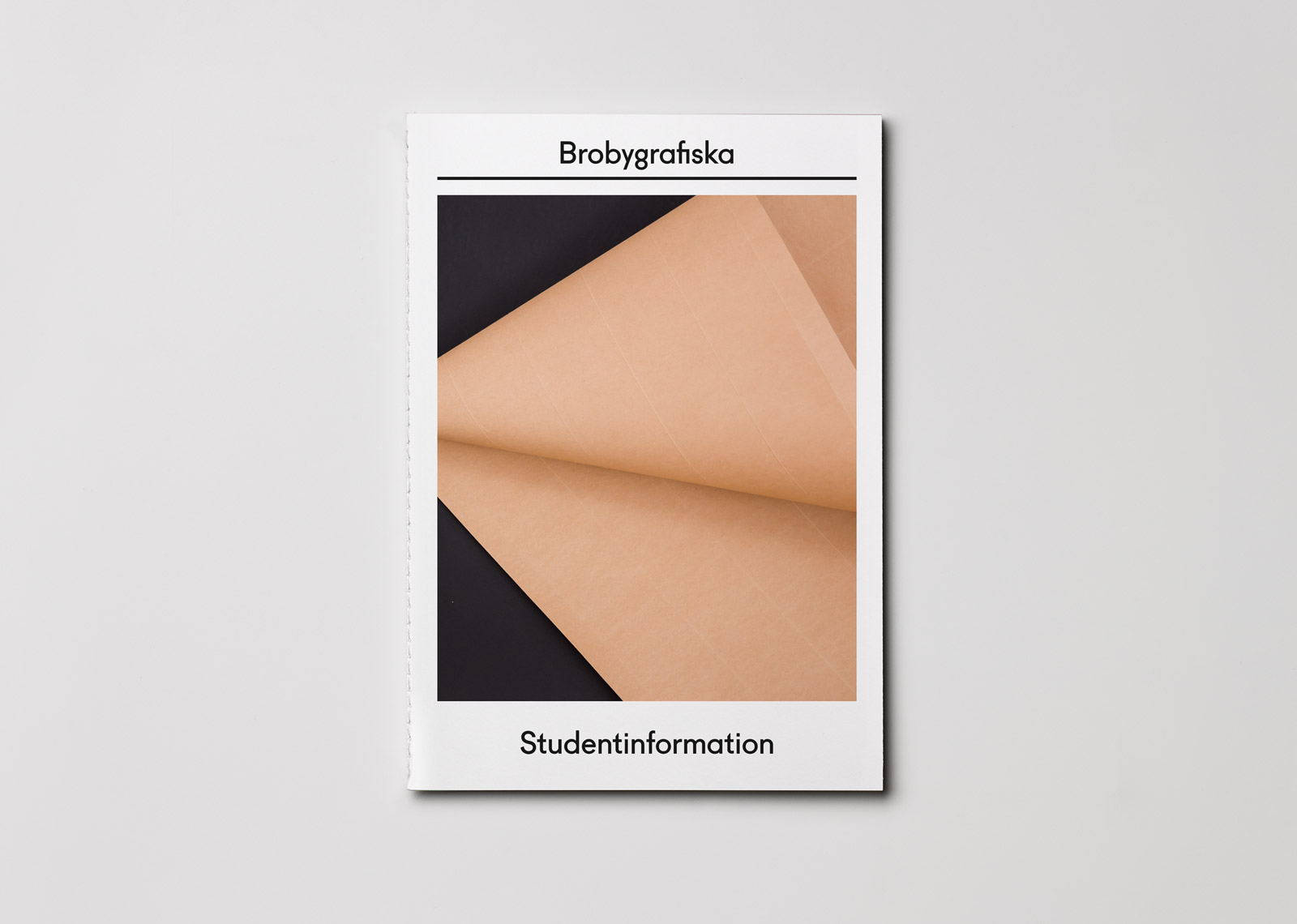
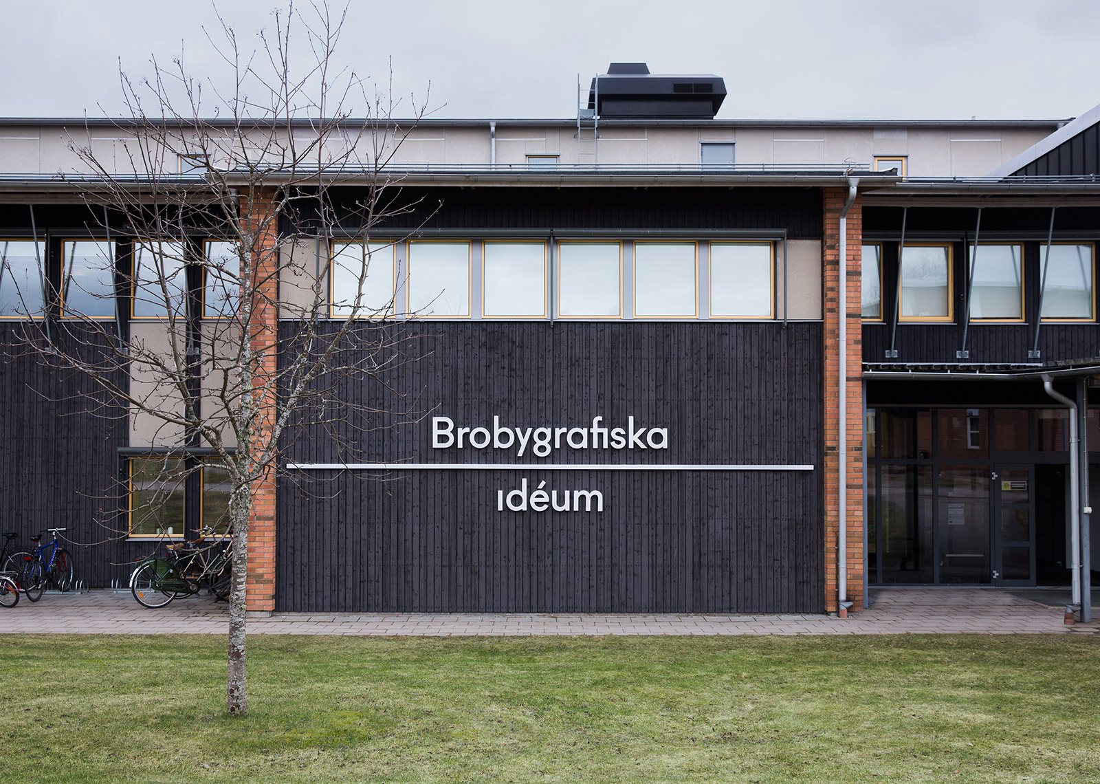
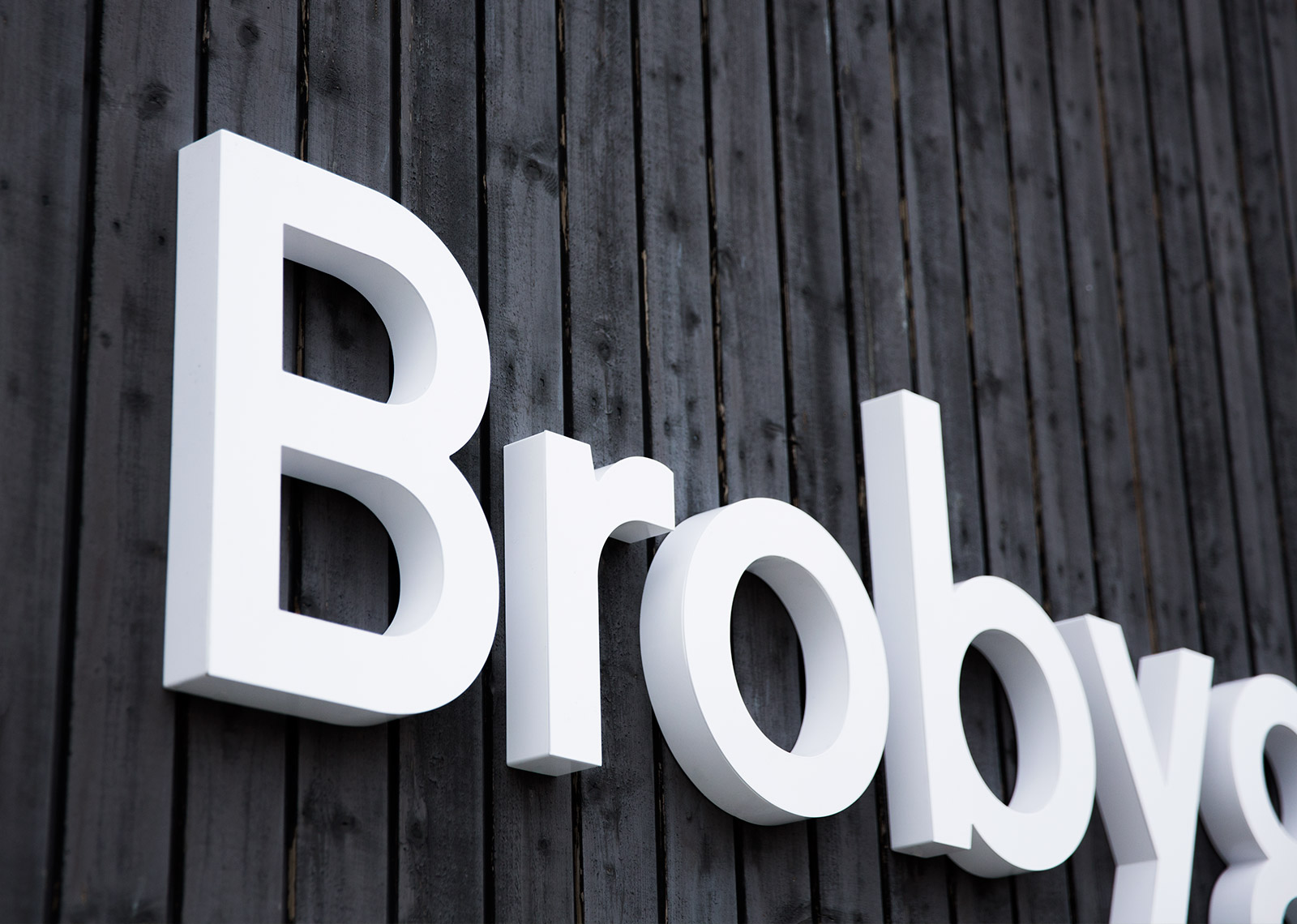
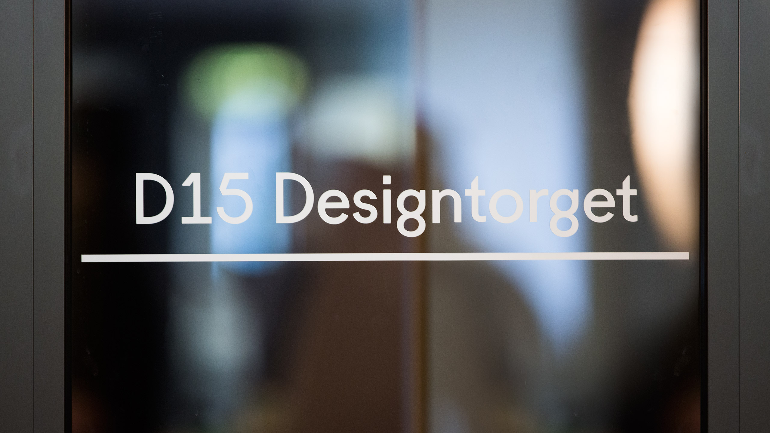
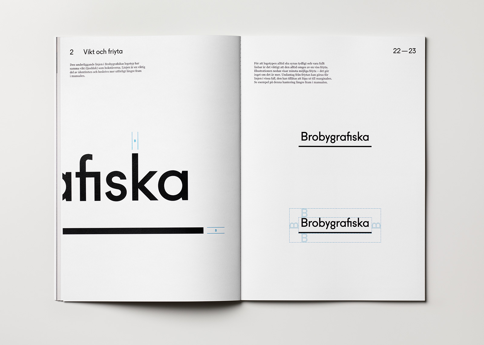
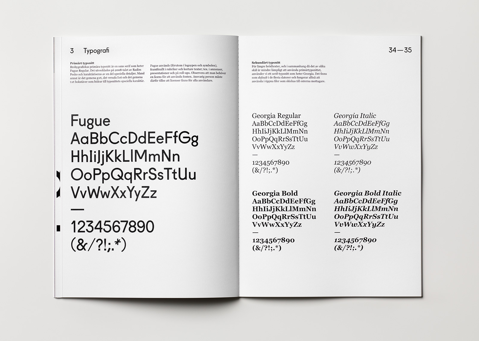
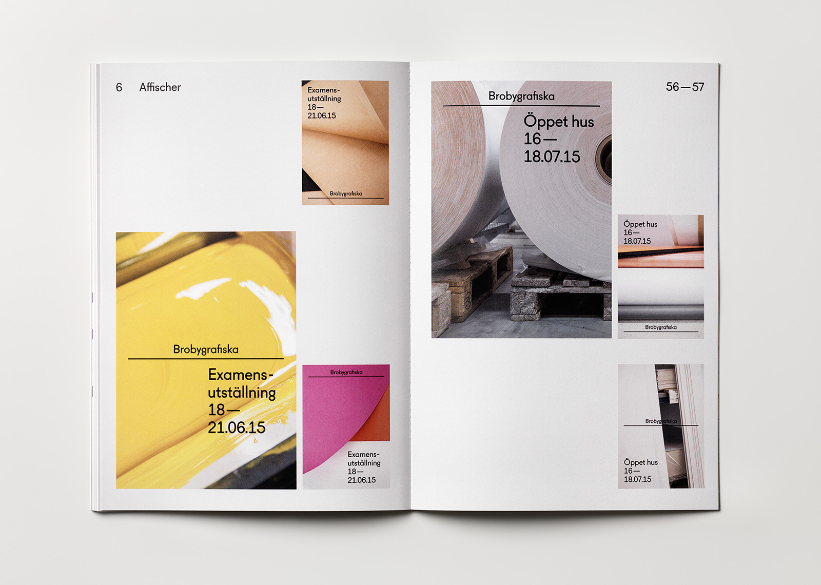
Designing an identity for a design school places high demands on the design; the identity should reflect the school’s character, inspire existing students and attract new students and partnerships. The identity was developed to be modern yet timeless, reflecting the forward-looking innovative spirit of the school as well as the craftsmanship and technical print knowledge that the school prides itself on. The typeface selected for the logo, display and headline communication is Fugue, a sans serif with a distinctly unique industrial character and classic geometric forms. A line below the name became the school’s symbol. Eternally changeable and dynamic, it symbolizes a solid baseline (fundamentals), a forward movement (innovation) and connection-making (communication).
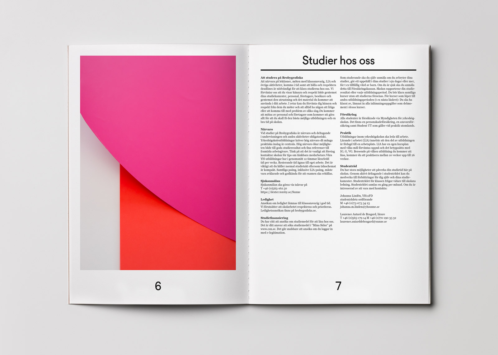
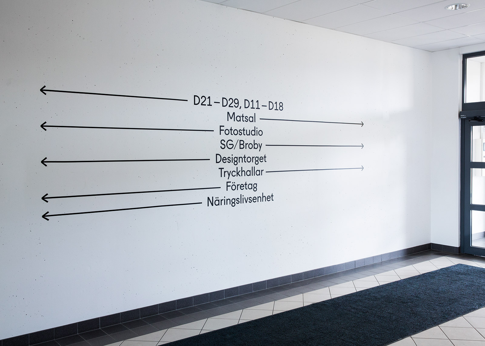
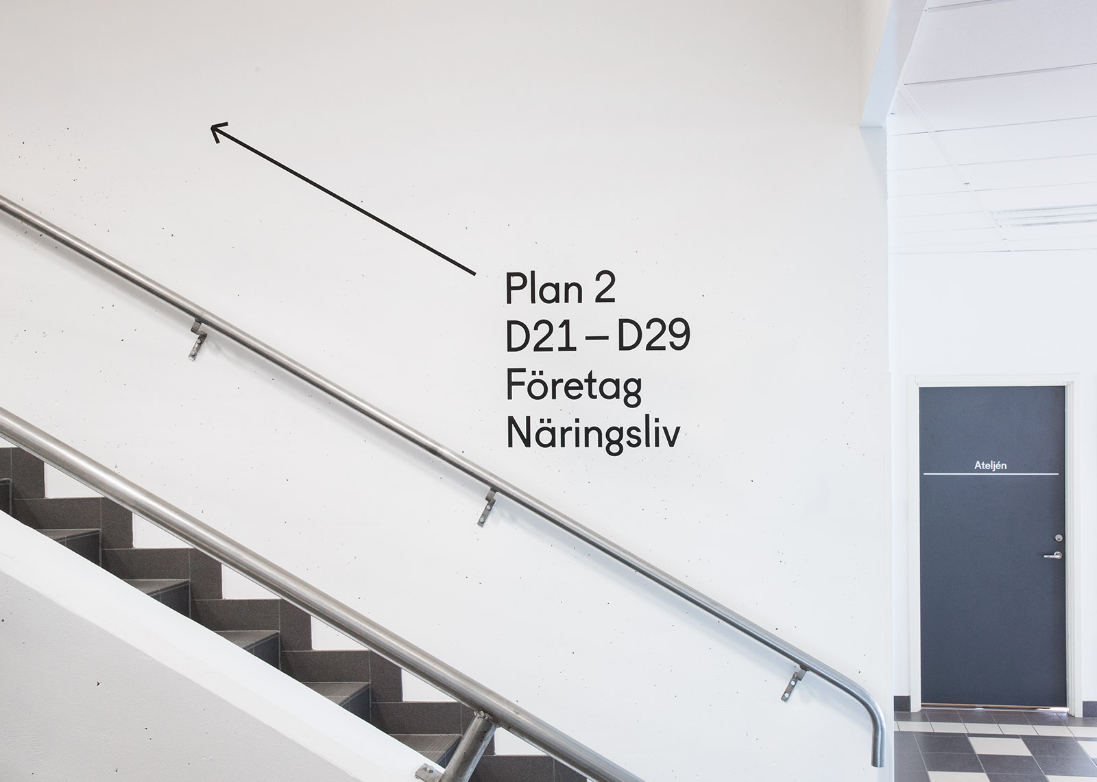
The identity was applied to everything from print and internal communication to exterior and interior signage as well as the design of a new website. The design allowed for a low budget production with a highly flexible system of communication material and templates which could be easily applied and printed in-house. The website was designed with the same principles of accessibility and easy maintenance, so that the integrity of the design would remain intact while varied content was easily updated internally by many different people.