H&M Typography
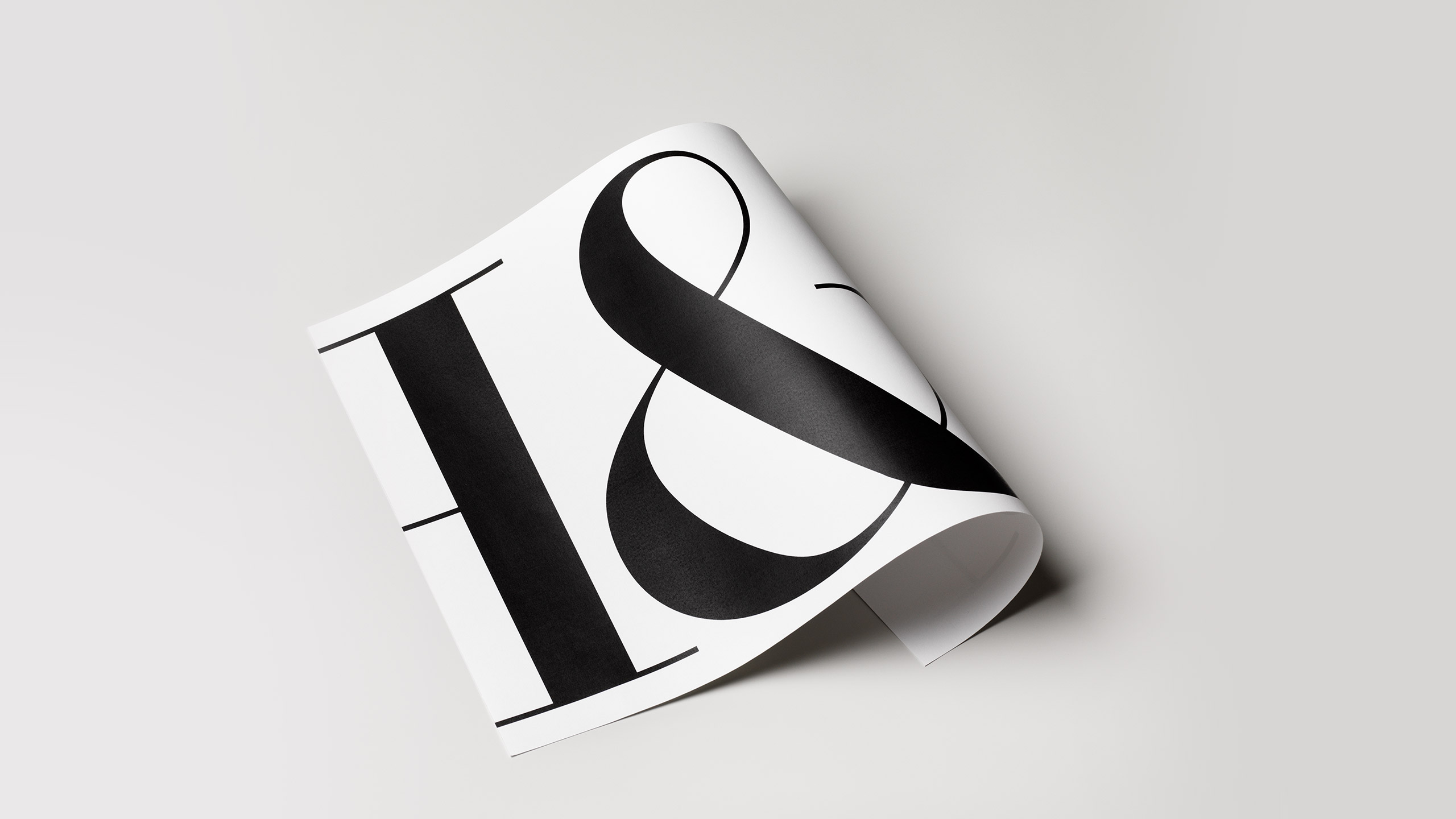
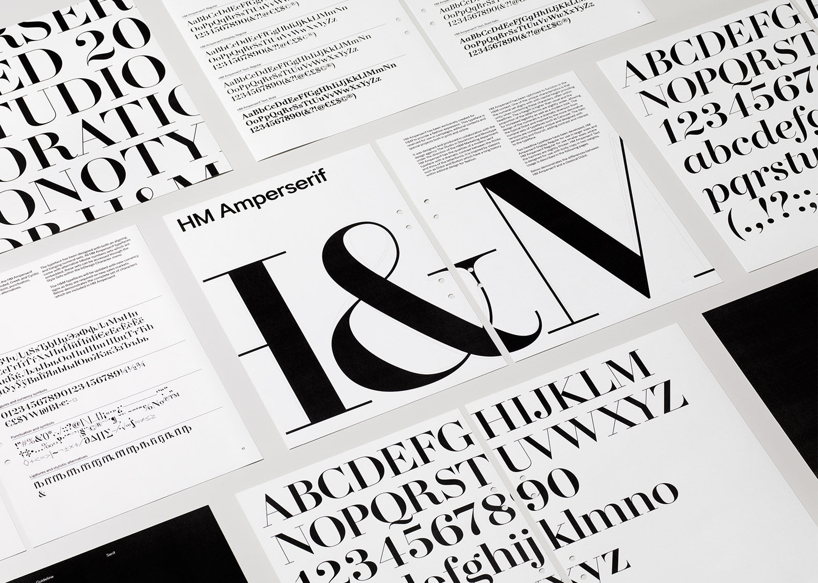
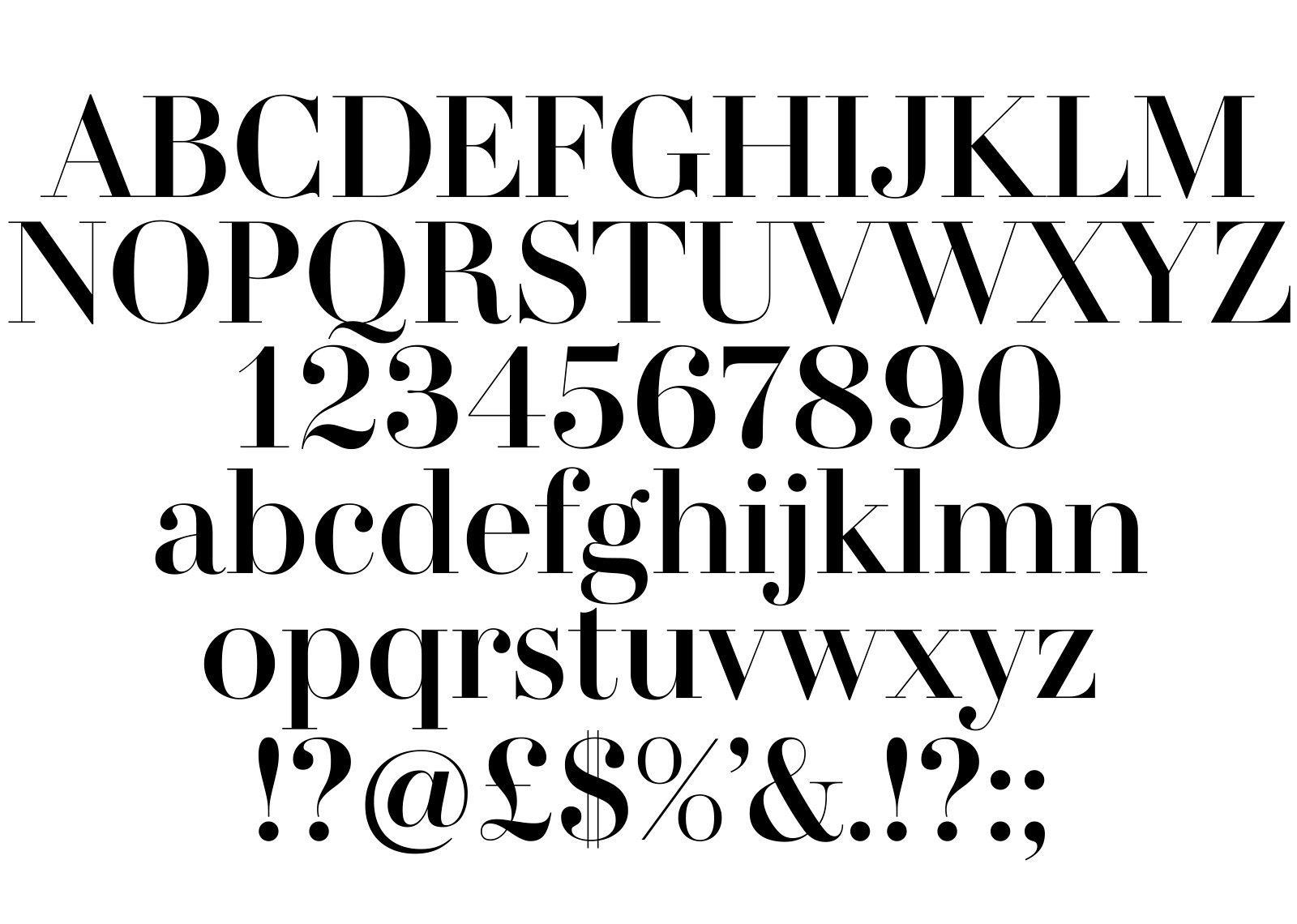
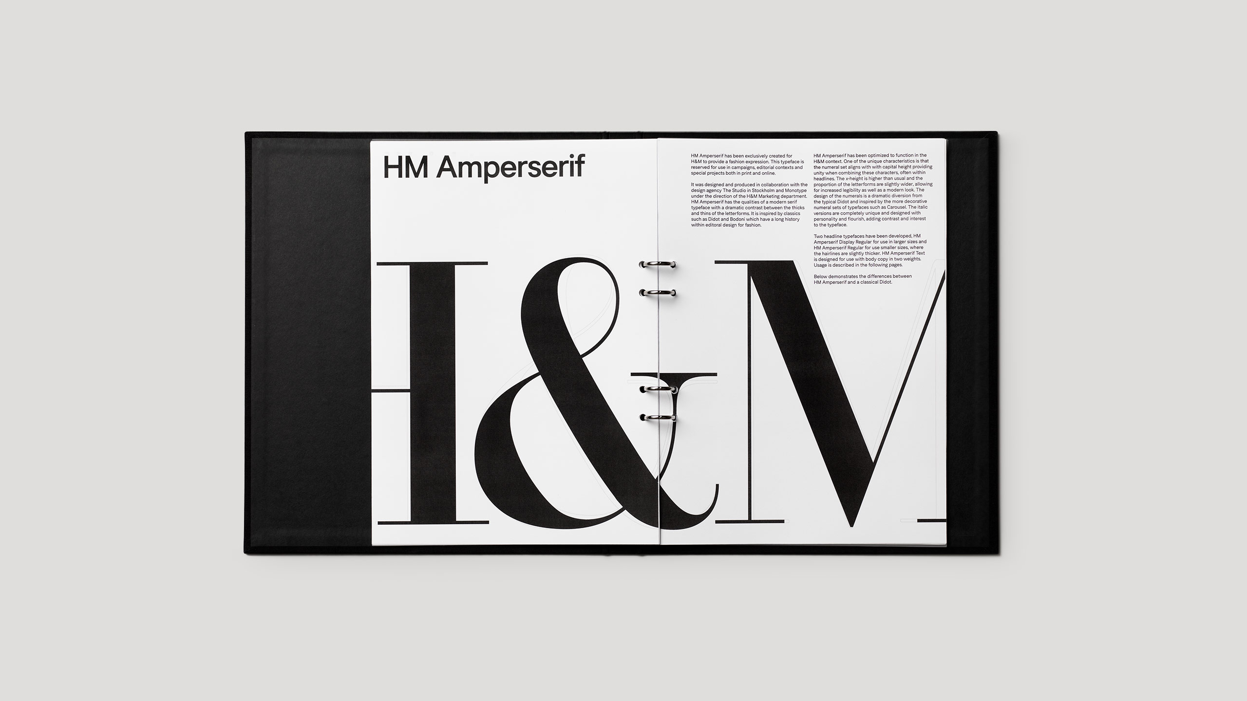
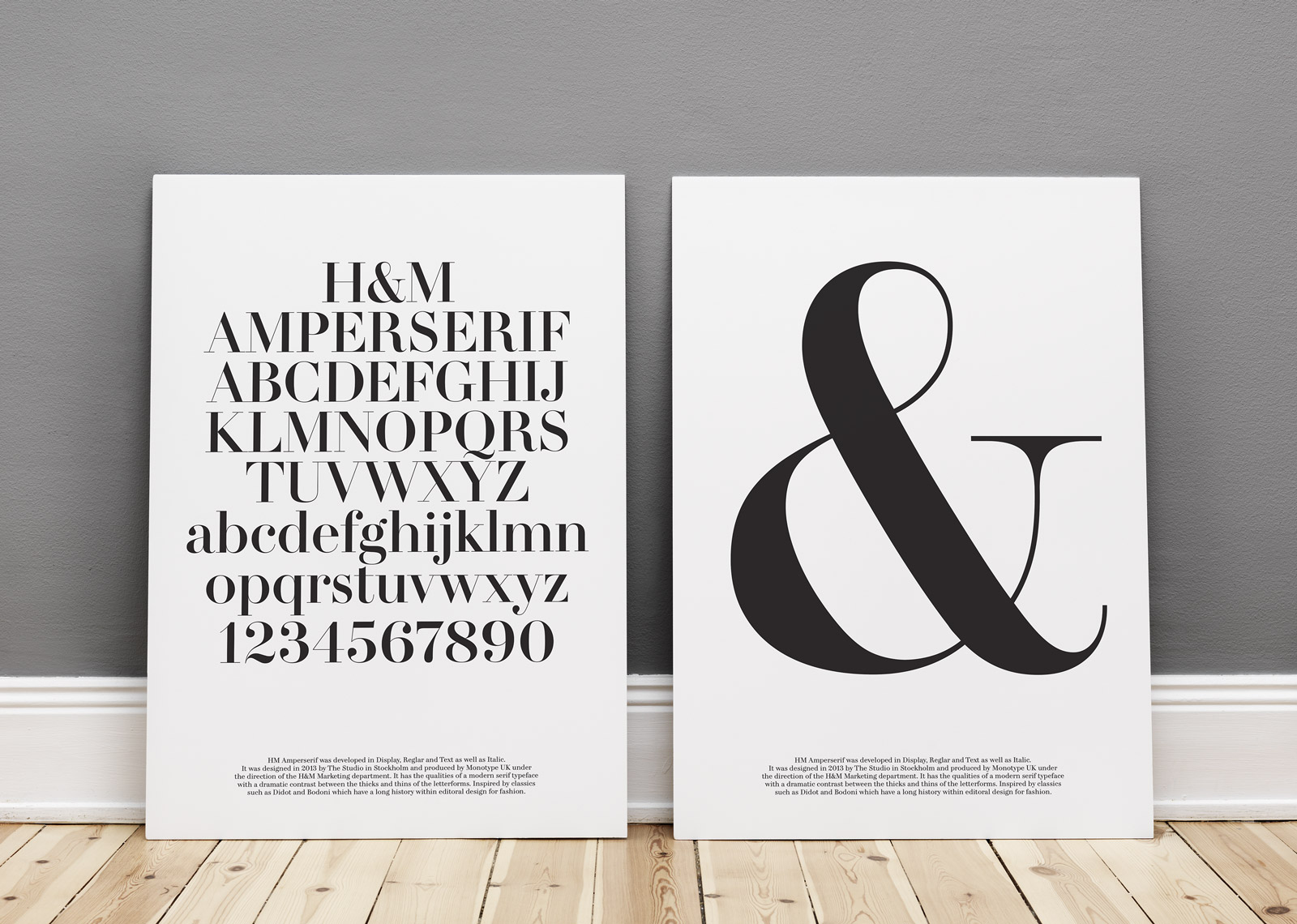
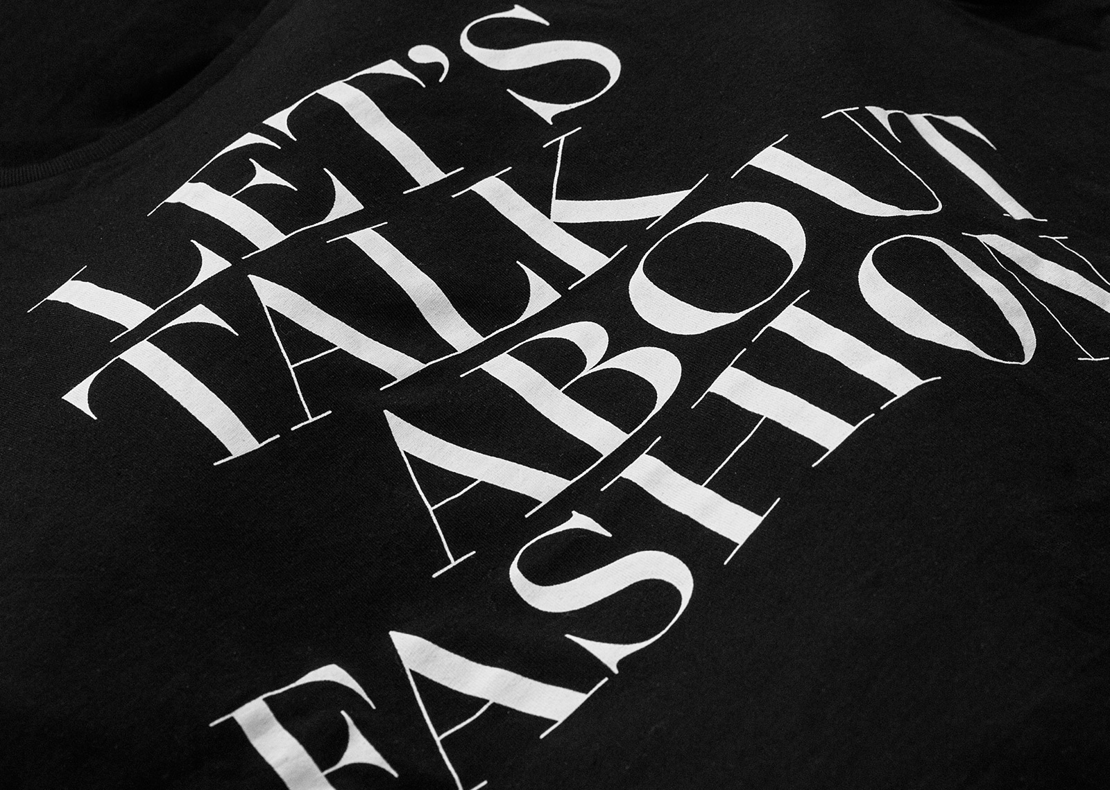
H&M was in need of a custom typeface with a fashion expression for use in all contexts including advertising, editorial, catalogue, website, film, packaging, and in-store graphics. The Studio worked with the H&M marketing department leading the collaboration with the type foundry Monotype UK for the design and development of the exclusive typeface for H&M, HM Amperserif.
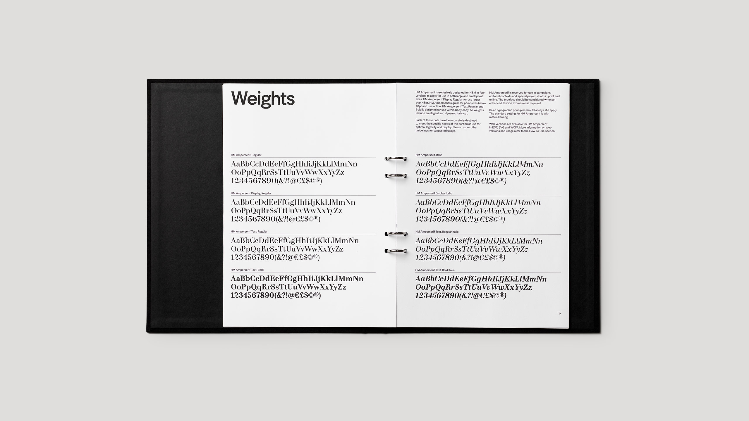
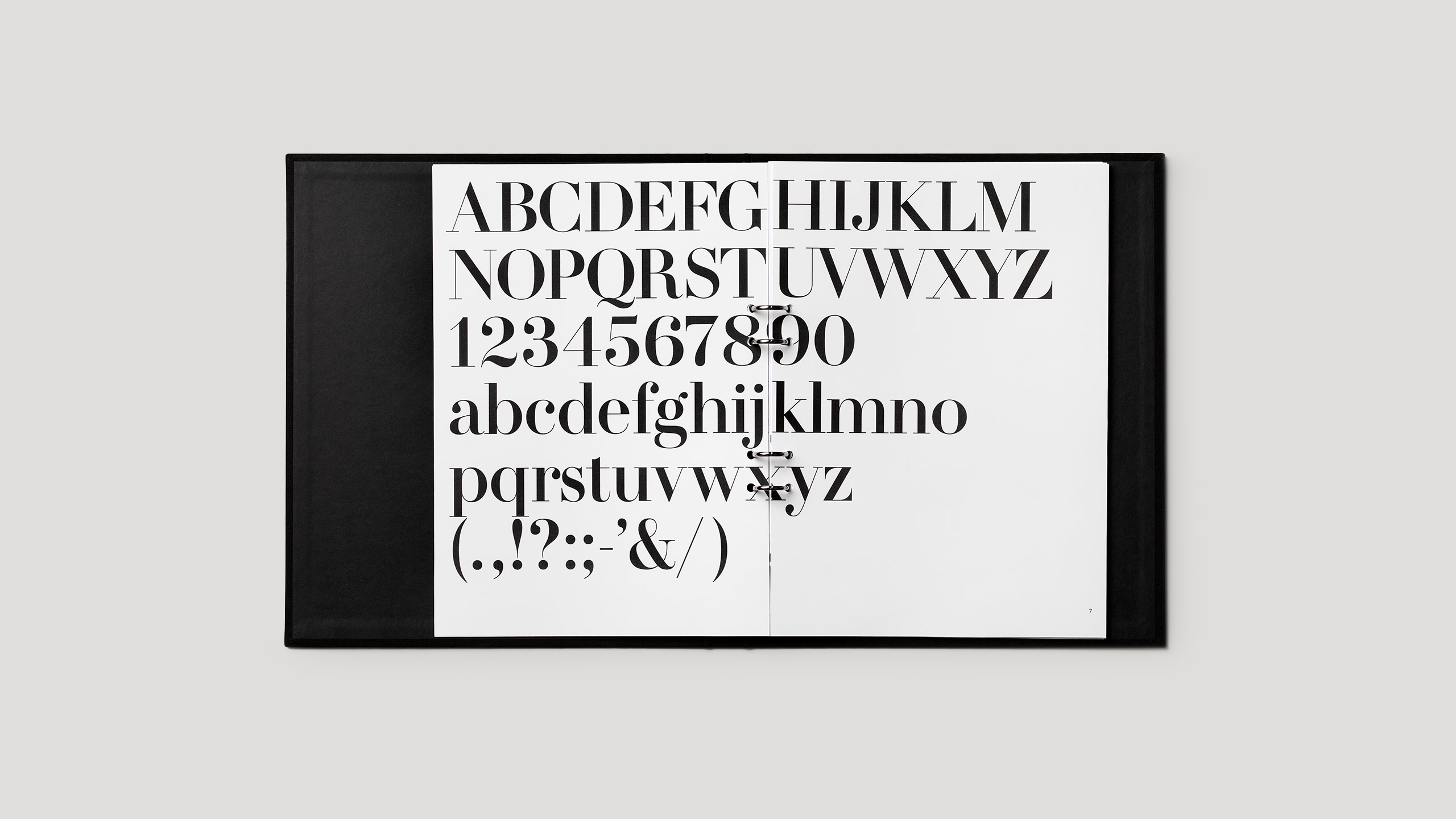
The typeface HM Amperserif was developed in three different size variations allowing for versatility of use in all contexts from the smallest caption size to the largest headlines on billboards as well as use in digital media while still maintaining the recognisable geometry of the letterforms. Special consideration was given to the numerals in relation to the capital letters for integration into headlines with H&M campaigns and price signs. The development of HM Amperserif allowed the company to reduce the number of typefaces used for communication which would eliminate the cost and complexity of working with licensed typefaces. The character set was developed in multiple languages to cover H&M’s 60 markets.
Over time and with consistent use, the new typeface HM Amperserif will become a recognizable identity-bearing element for the H&M brand. Following the design of HM Amperserif, a typographic guideline was developed for the use of all H&M typography.
Case photography: Patrik Lindell