Drinking helps
Lemonaid is a charity organization formed in 2008 with an ambition to create beverages that both taste and look great, while leading positive change to make a difference in the world.
A revolution in the industry, Lemonaid quickly gained a following within a nichéd group, as a popular drink mixer in bars and music festivals. The company has grown to become an independent beverage success in thousands of outlets across the globe.
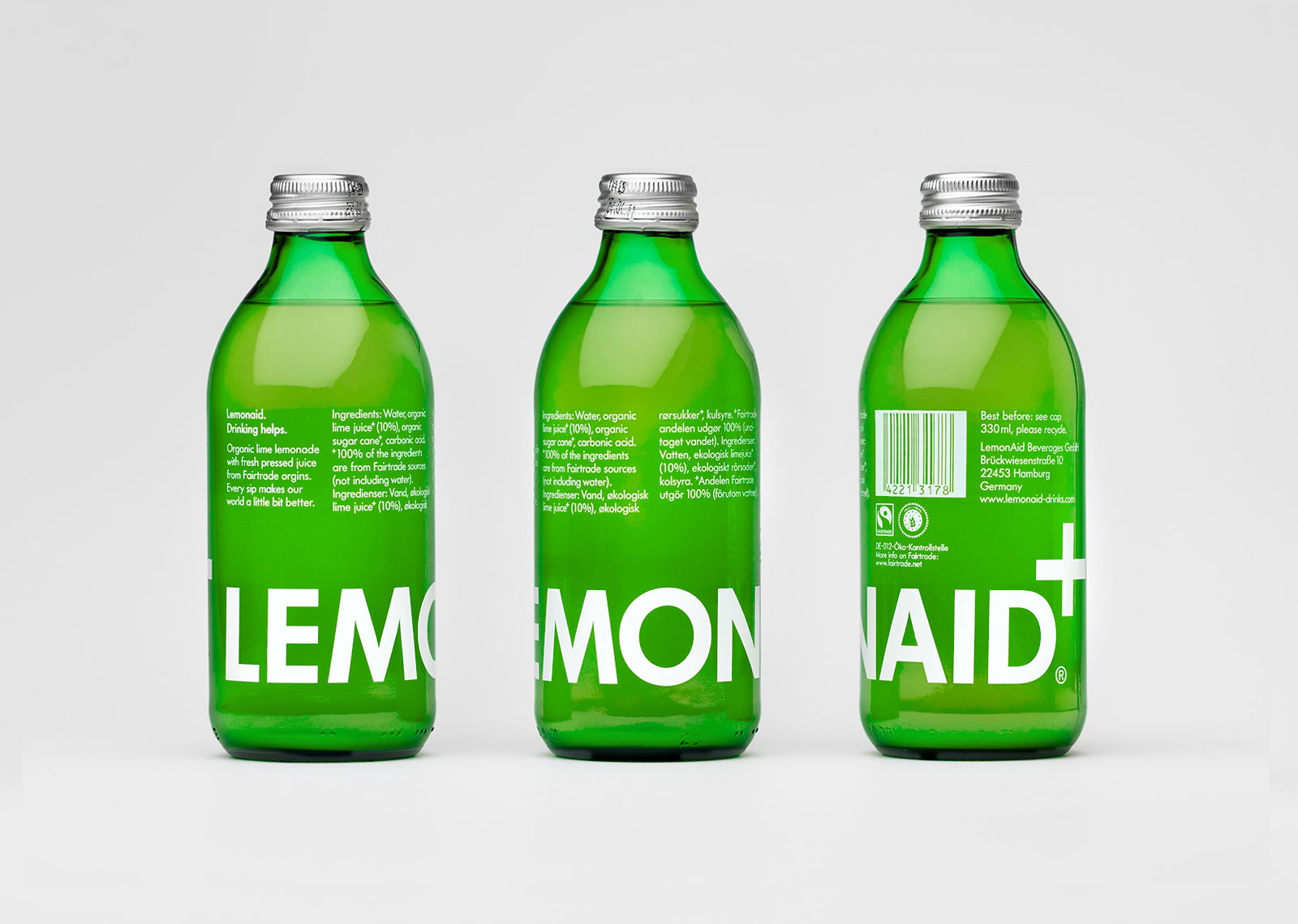
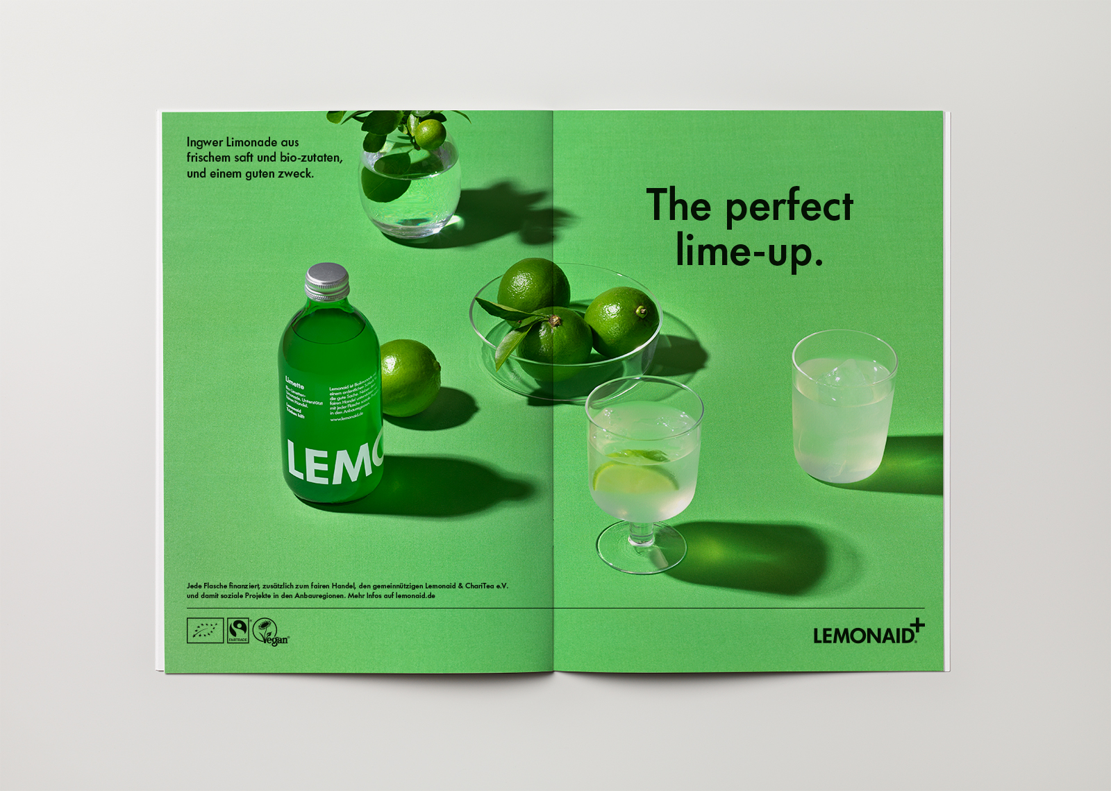
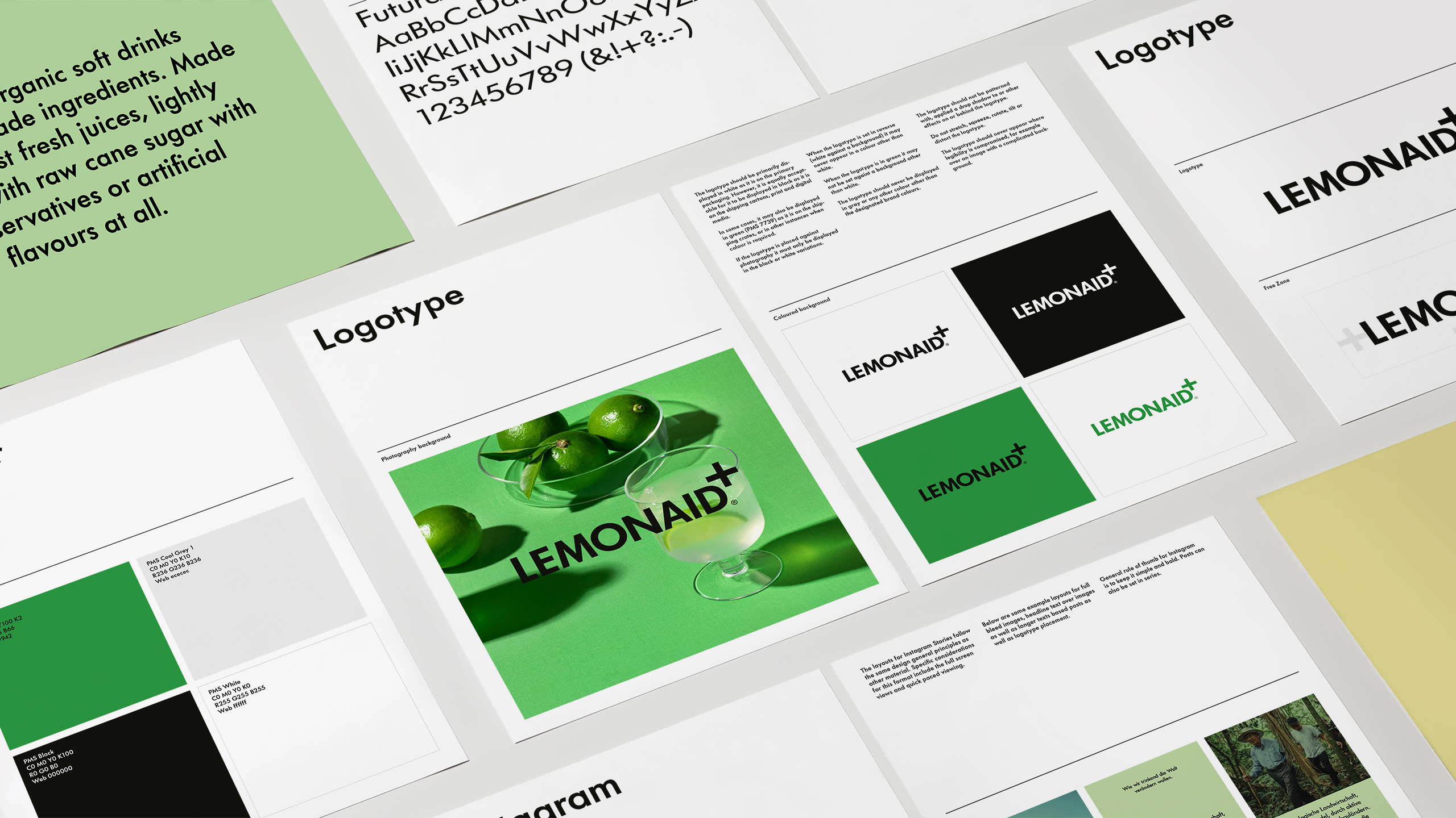
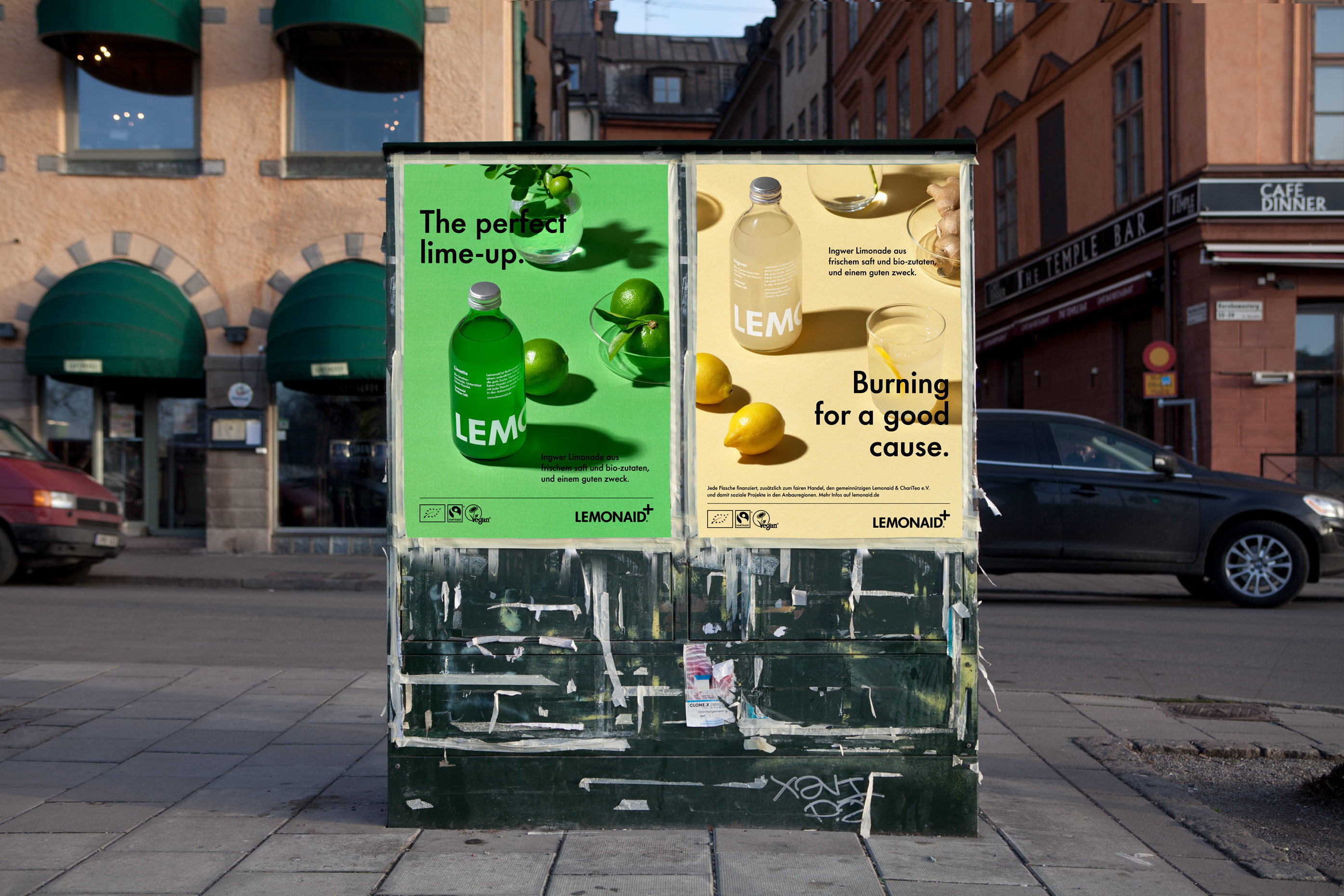
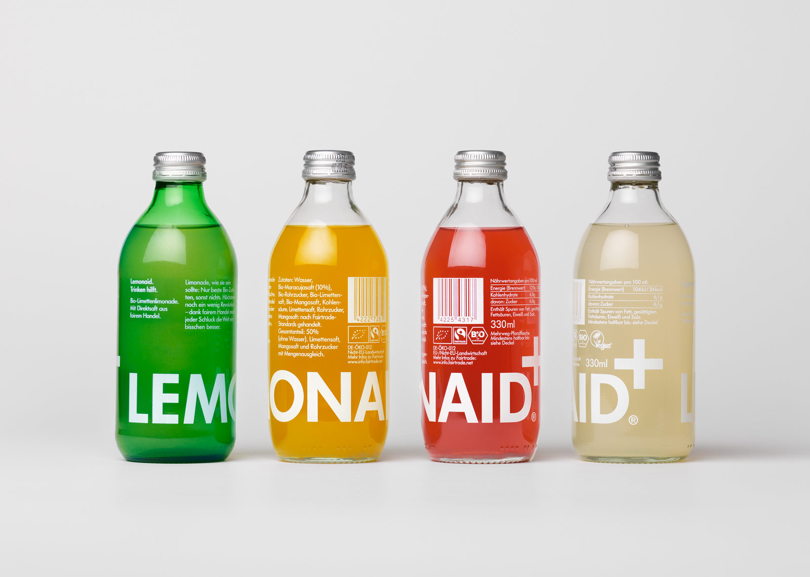
The logotype integrates the cross symbol, the universal code for aid. The graphics wrap around 360° for play on the shop shelf, while the shape of the glass bottle sits nicely in the hand.
Our design collaboration has spanned over ten years and includes the development of a wide range of brand assets, from identity and packaging design to art direction and graphic guidelines, compiling it in a brand book, aptly named “BrandAid”.
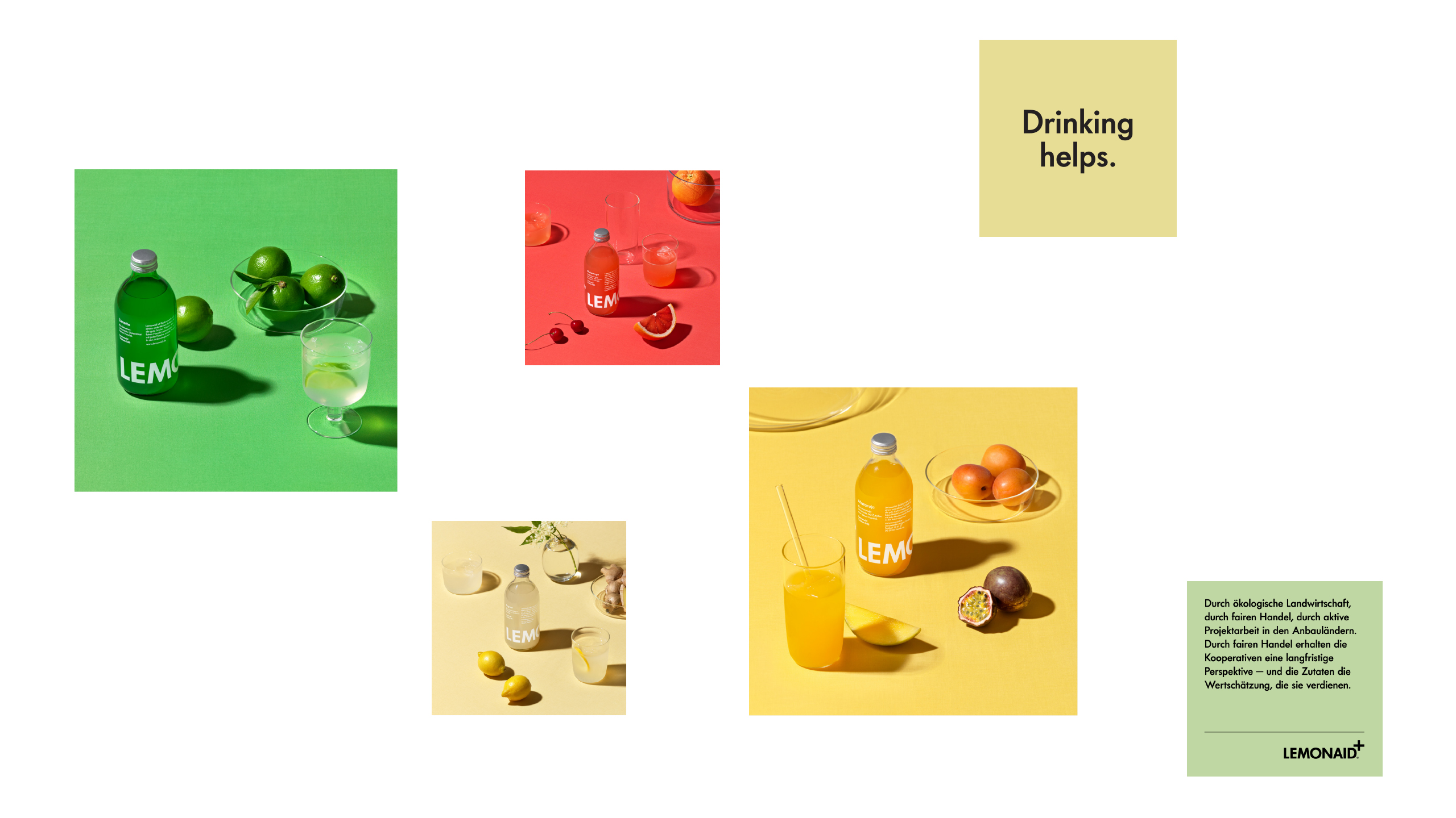
The Lemonaid foundation is leading positive change, and has donated millions of euros for social projects within developing countries such as South Africa, Sri Lanka and Latin America.
Lemonaid
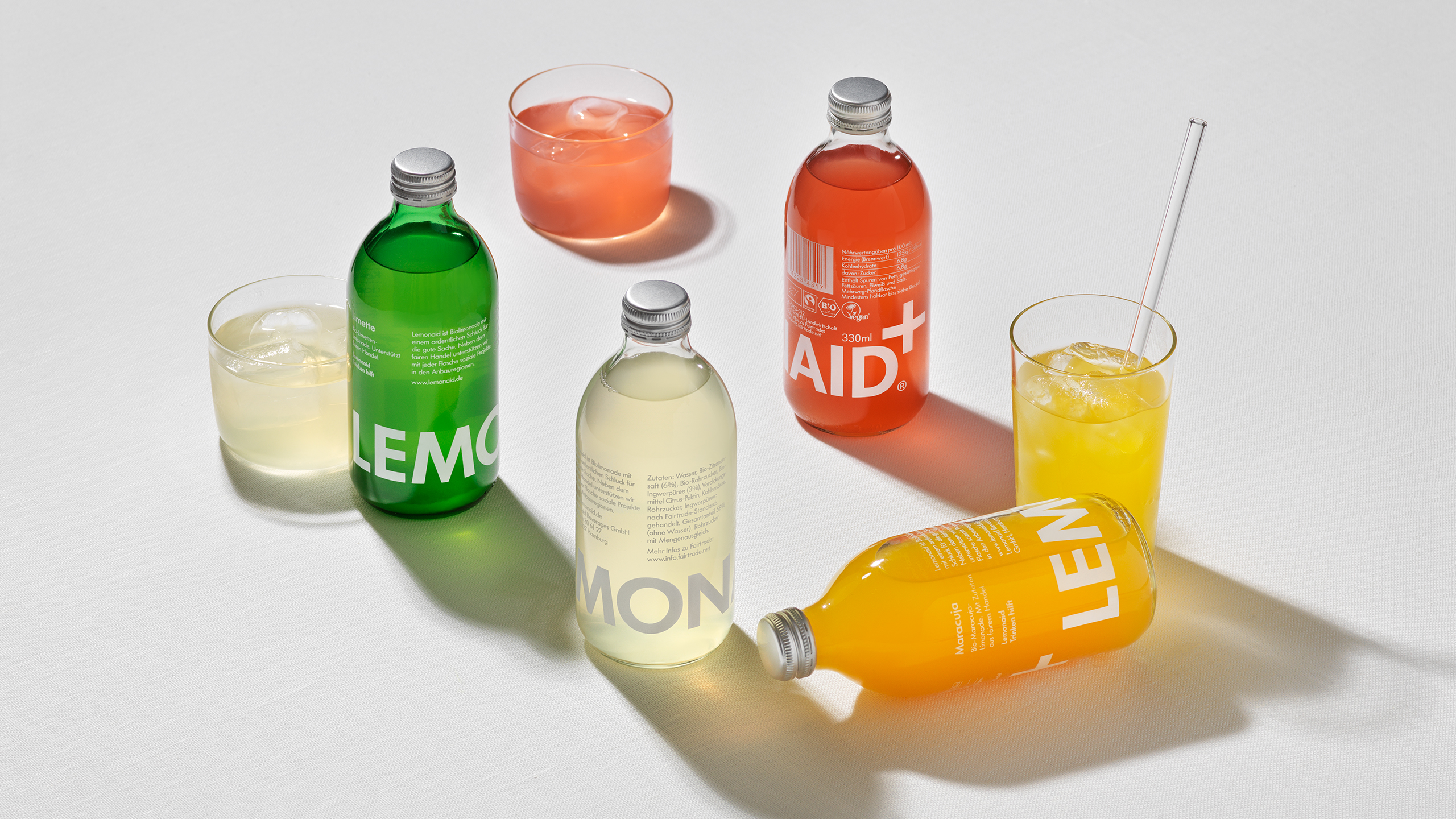
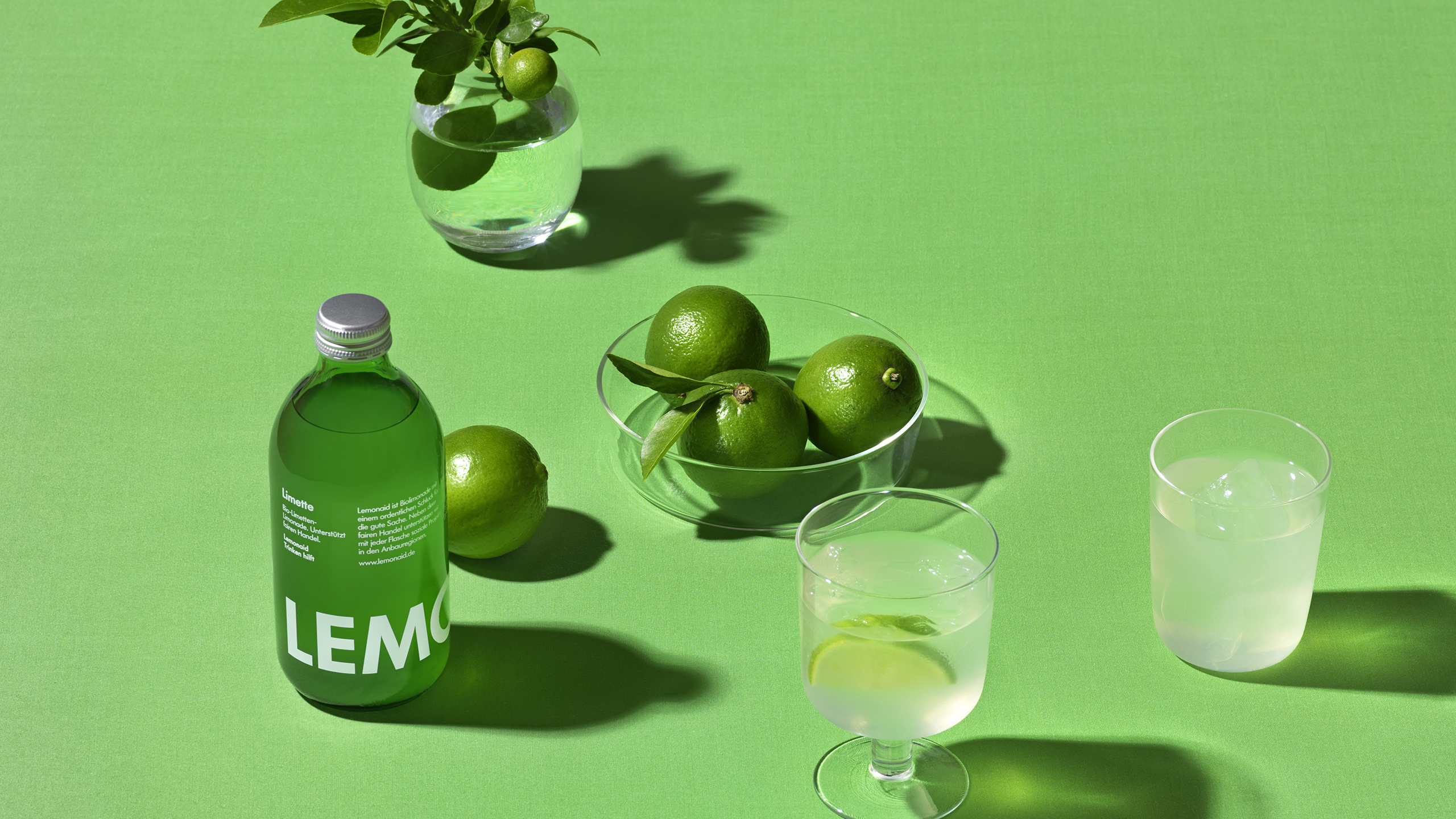
Lemonaid is a German charity organization formed in 2008 with an ambition to create beverages that would both taste and look great, whilst leading positive change in the world. The idea was to produce products that compete on their own merits – not only by appealing to people’s consciences. Lemonaid Lime was the first of three products developed; a traditional lemonade made with 100% fair trade and organic ingredients. Aside from being of high quality and tasting great, the product also needed to have a unique and appealing design that would stand out on the shelf. For this, they turned to us.
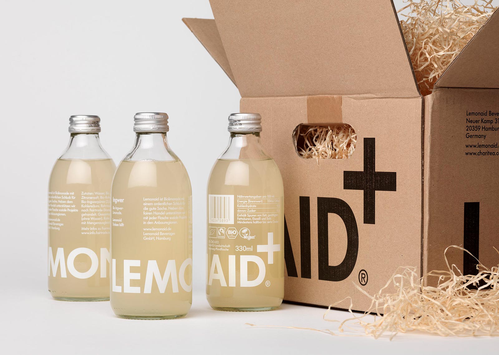
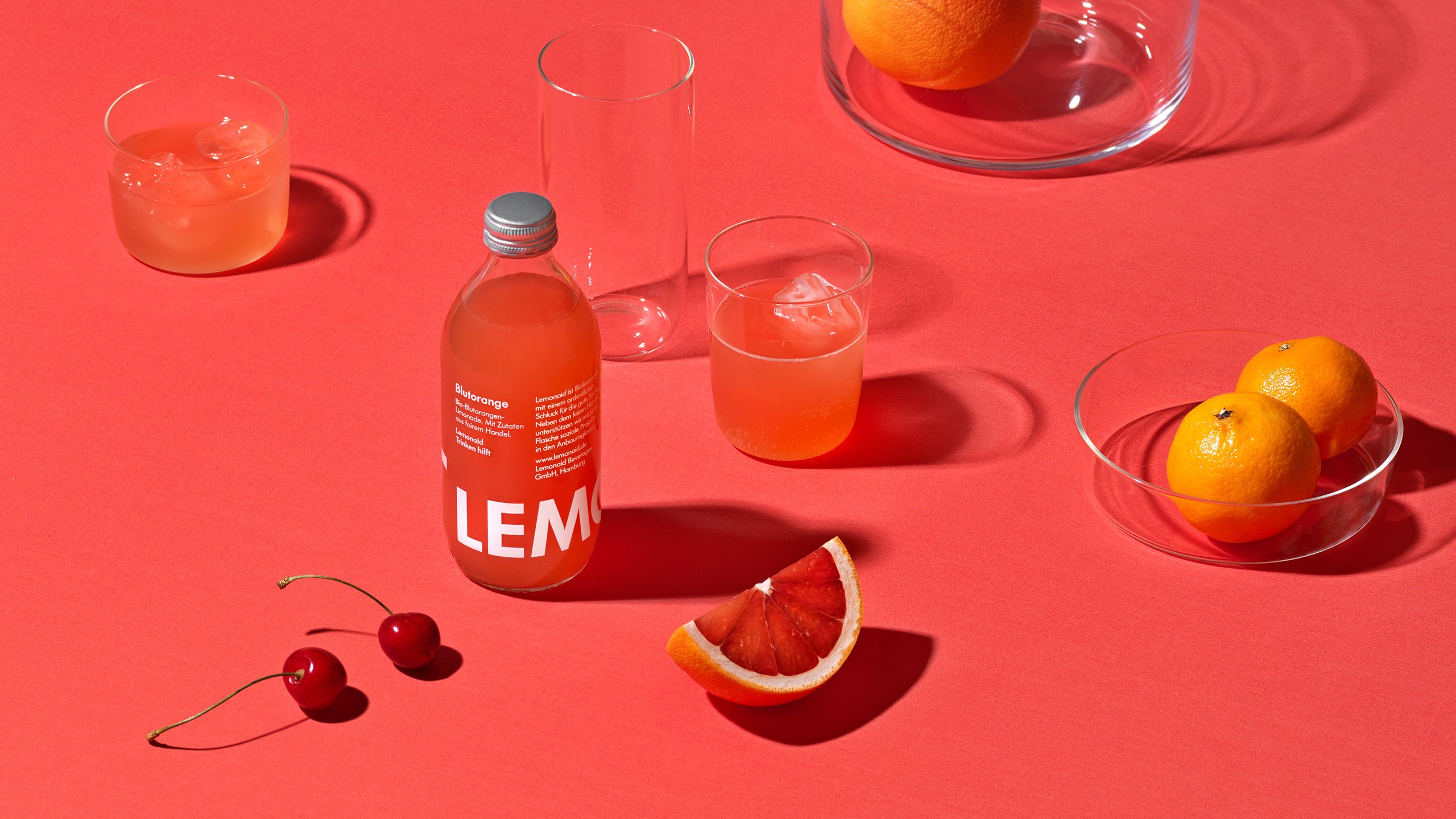
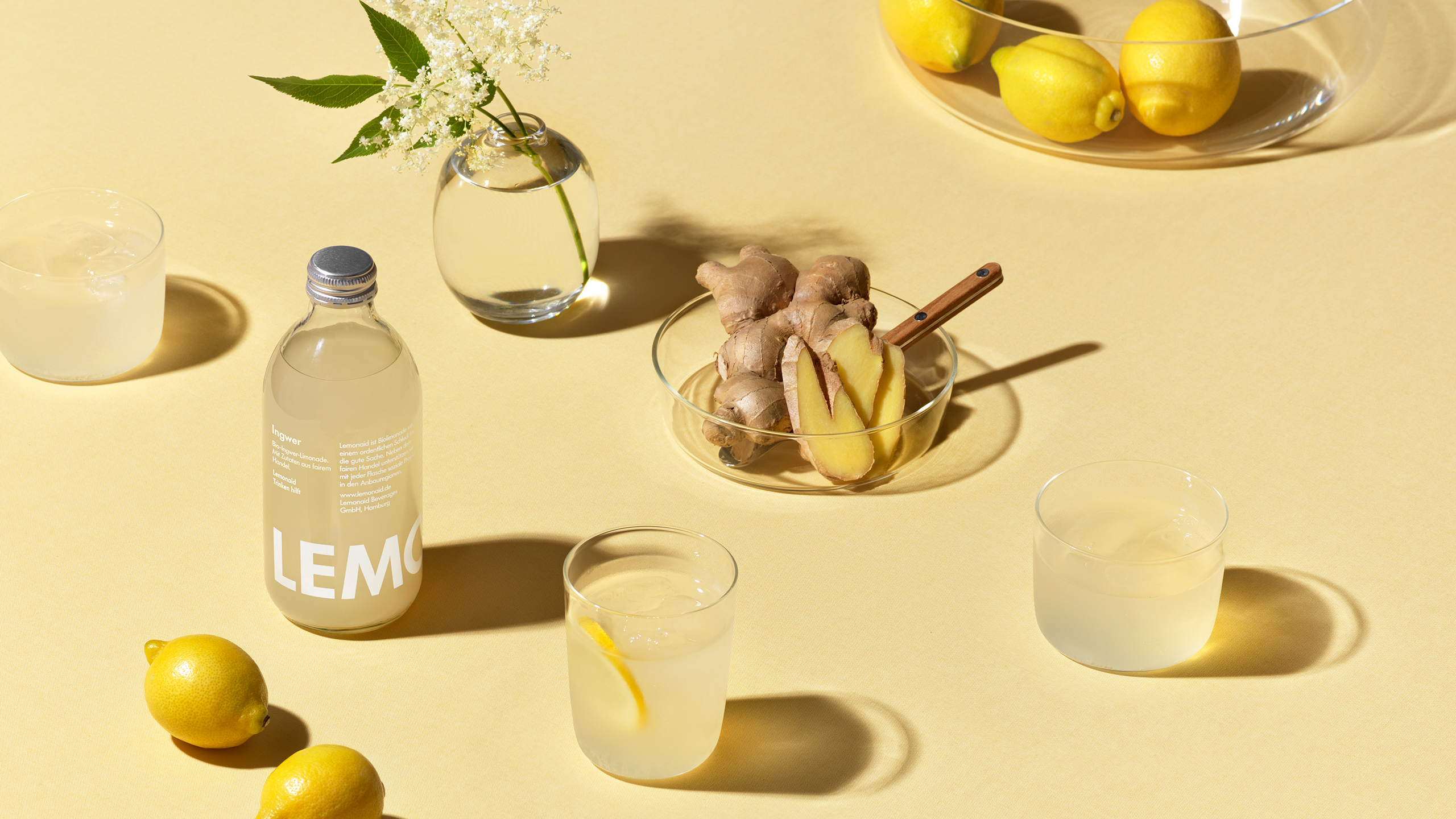
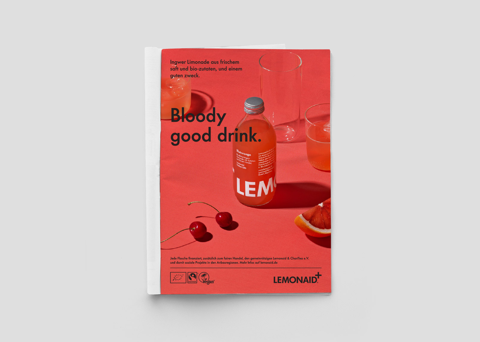
The friendly shape of the green glass bottle sits nicely in the hand while standing out against the sea of plastic bottles. The packaging was designed without a specific front, the graphics wrap around 360° for impact when placed together on the shop shelf. The logotype designed for Lemonaid includes a cross symbol; the universal code for aid and rescue. New flavours were swiftly introduced and for these, transparent bottles were used and the bright colours of the liquids, yellow and red, complemented the green of the original flavour. Pure materials and clean processes, aluminium caps, direct printing on glass emphasize the authenticity and craft of the product. A circular packaging process, by which glass bottles are collected, sorted and refilled meets the company’s ambitious sustainability demands.
The combination of a high-quality product, the authenticity and transparency the company, and the iconic design (really, the recipe for success for any brand!), soon made Lemonaid a cult brand, and within months sales took off throughout major cities in Germany. Ten years after the launch, Lemonaid and its sister brand Charitea (a range of bottled, freshly-brewed teas) can be enjoyed in thousands of outlets across Europe, the US and Asia. Million of Euros have been channelled back to local community aid projects in countries such as Sri Lanka, Paraguay, Mexico and South Africa.
Our design collaboration has spanned over ten years and includes the development of a wide range of brand assets, from identity and packaging design to art direction and graphic guidelines, compiling it in a brand book, aptly named “BrandAid”.
Photography: Patrik Lindell