An identity for the masters of power
Powerbox is a Swedish company that designs and markets premium quality power conversion systems since 1974. When bought by venture capitalist Alder in 2013, The Studio was brought in to develop a strategic brand platform, a new tagline, and a graphic identity.
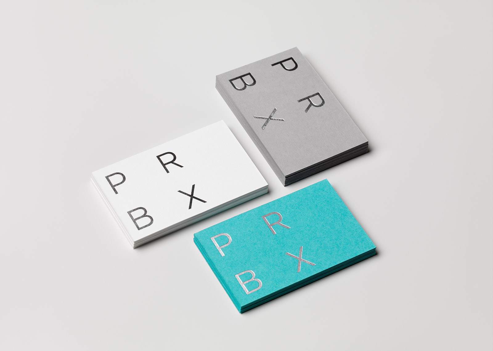
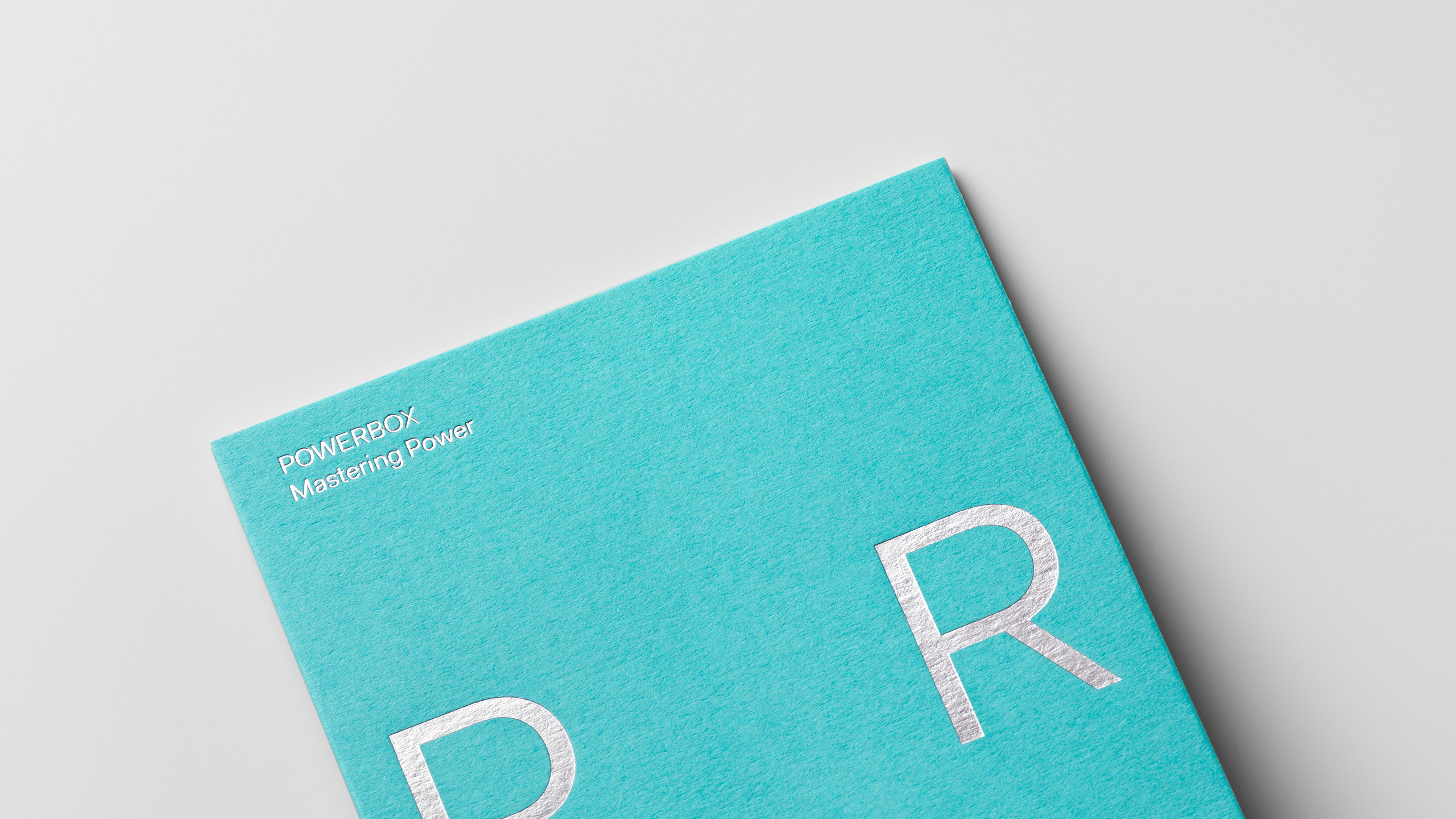
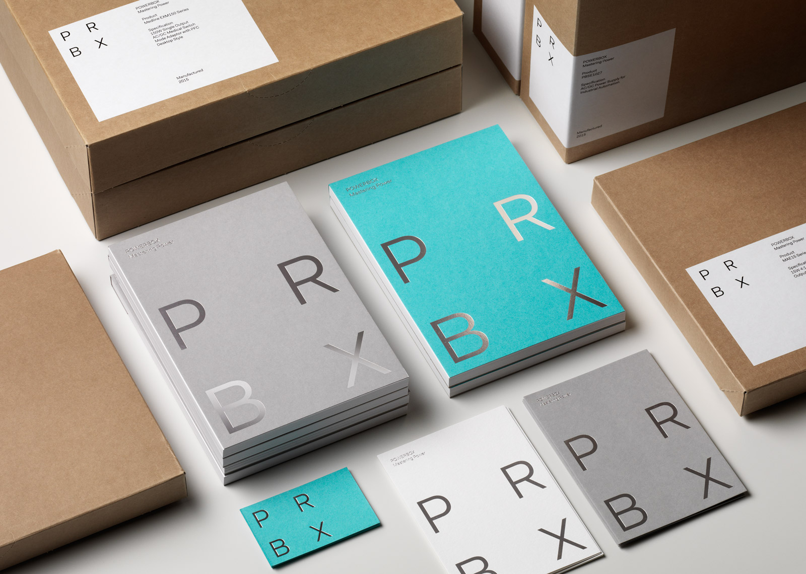
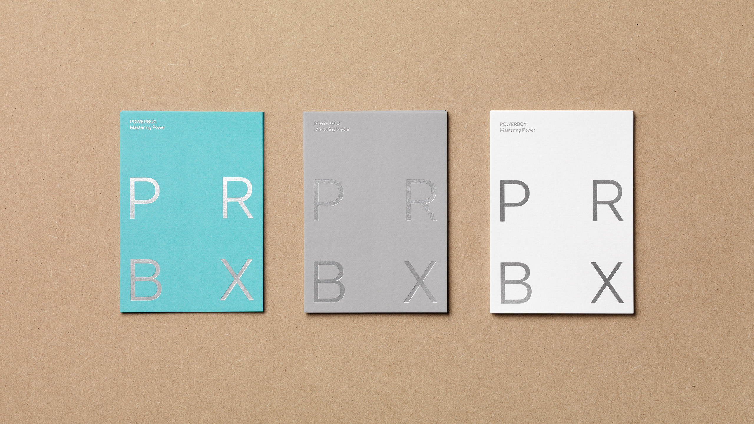
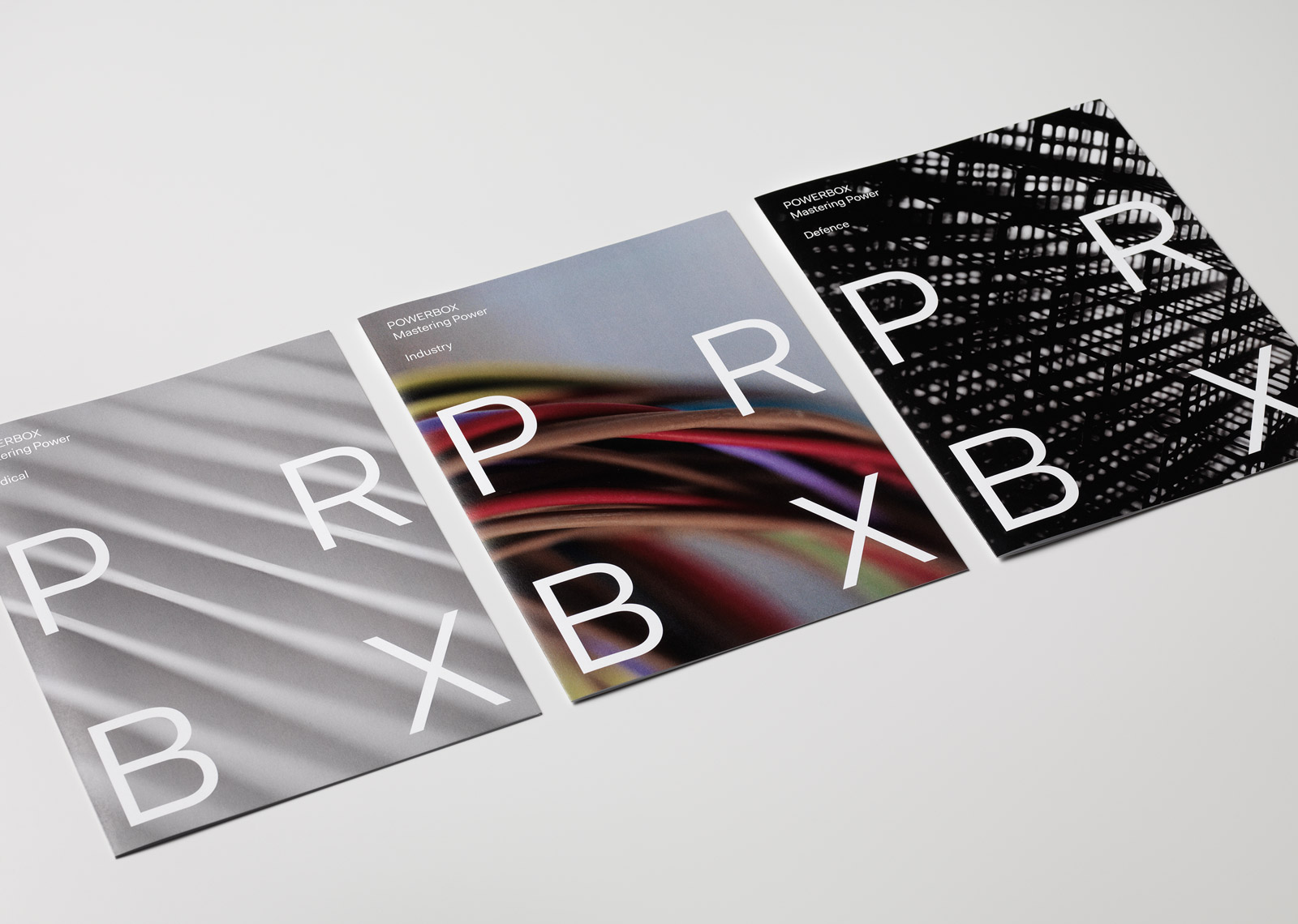
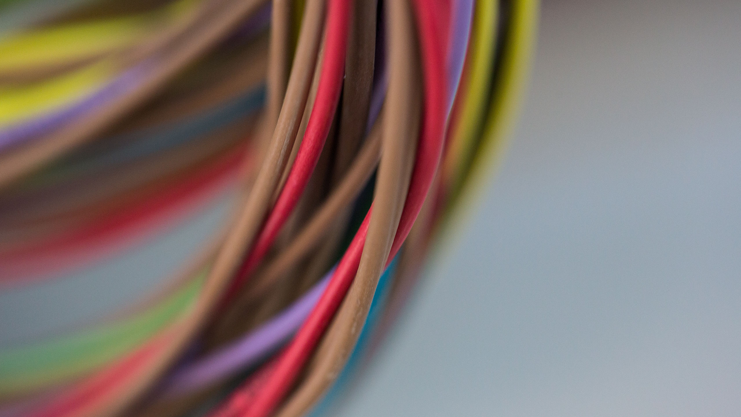
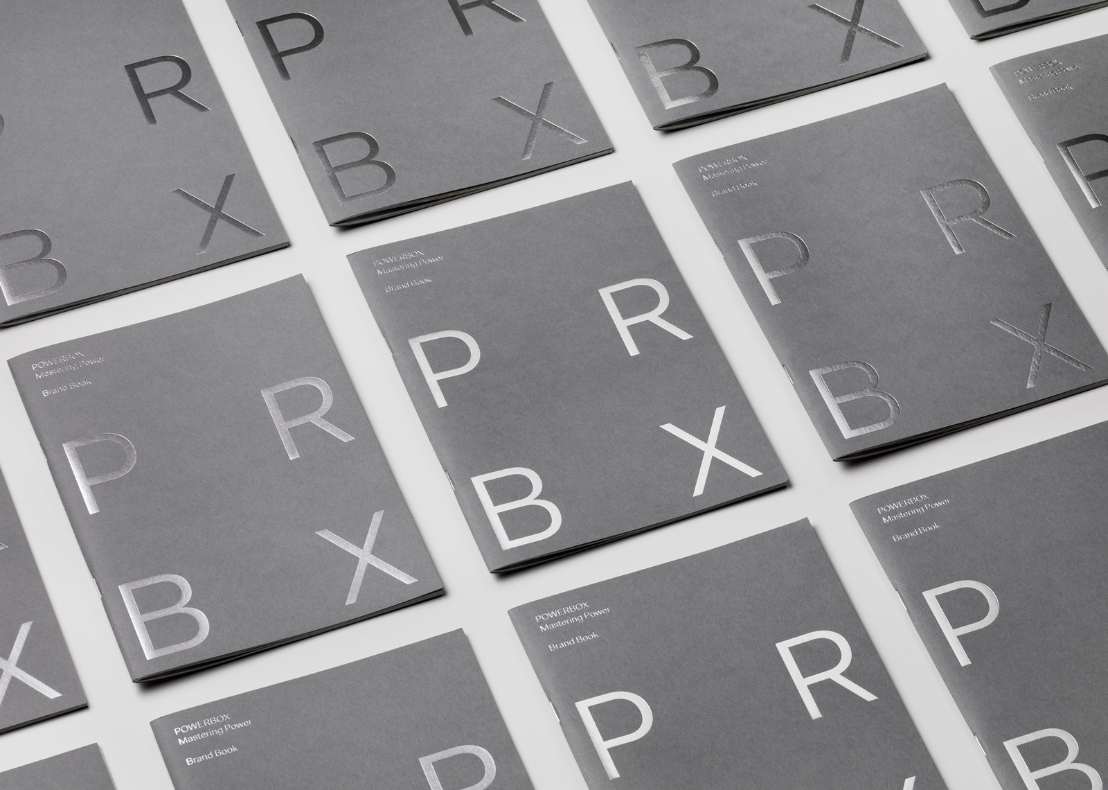
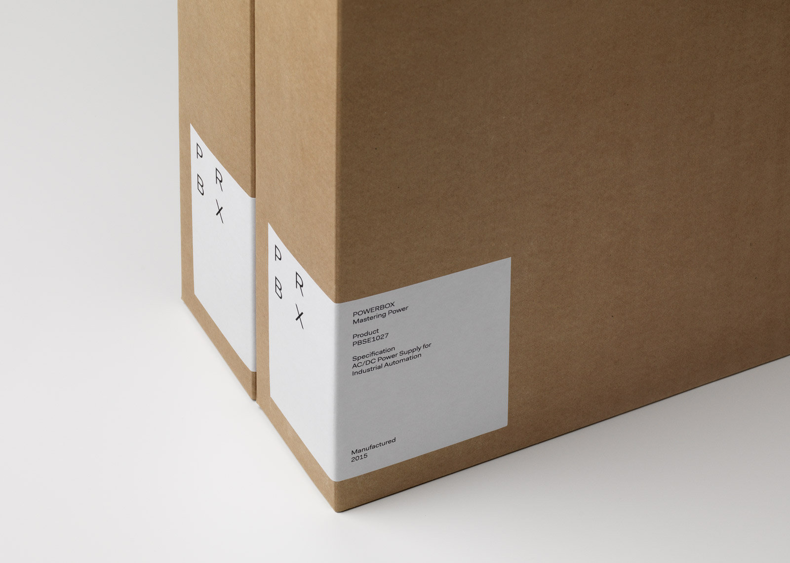
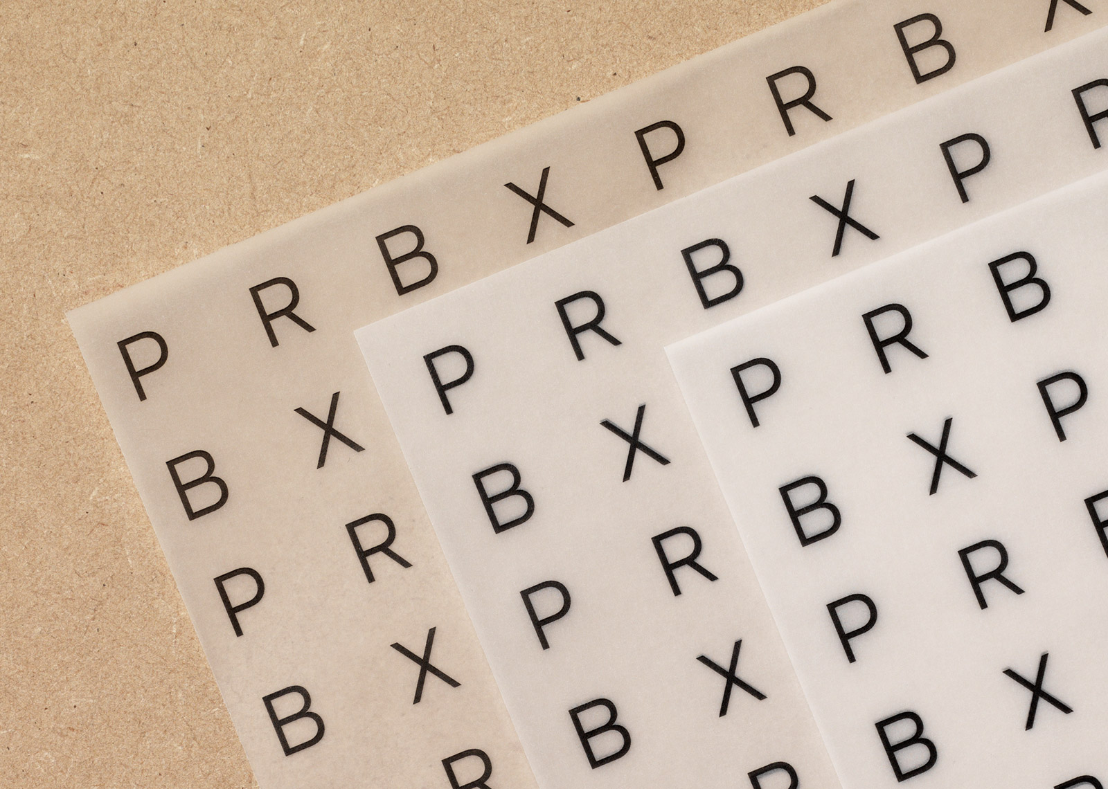
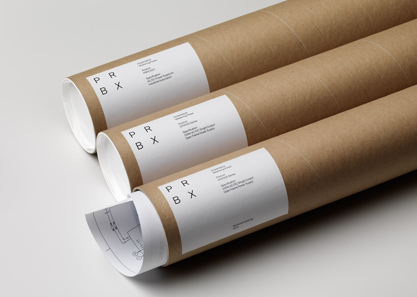
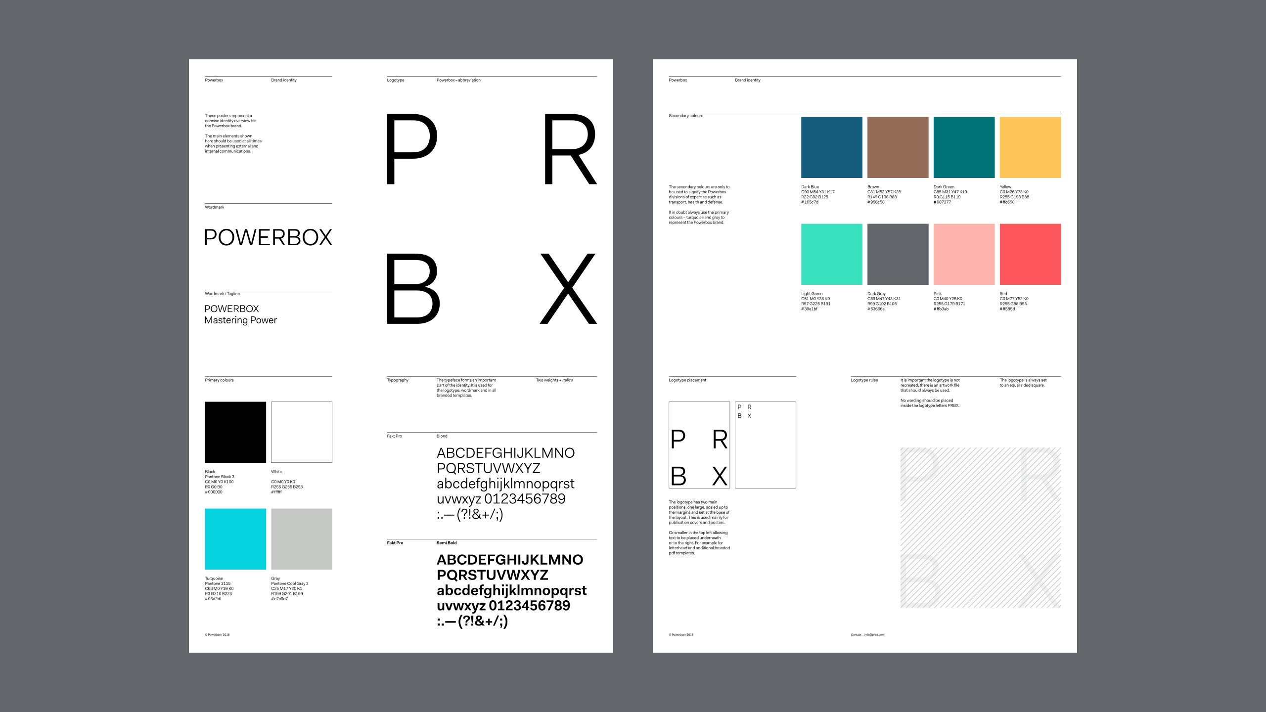
The rather generic name Powerbox was shortened to PRBX in the logotype, to spark interest. The letters were set in a square to underscore the “box”. A teal colour, unlike anything else found in the industry in terms of identity colors, was given a prominent place in the identity toolbox.


Powerbox
Powerbox is a Swedish company that designs and markets premium quality power conversion systems since 1974. It was bought by venture capitalist, Alder, in the fall of 2013. Under new management, a new business plan was developed that was focused around adding value to the products in the form of expertise, service and knowledge. The rebirth of the company and plan to ascend up the value chain also necessitated a new strategic direction when it came to branding, positioning and graphic identity. The Studio was commissioned as a strategic branding partner.
We found that in this traditional, heavy industry, qualities such as warmth, humour and emotion were virtually absent, and that communication and branding were conventional and homogenous. The Studio saw this as an opportunity to emphasize the company’s expertise within power supply by introducing the tagline “Mastering Power” and set a tonality for the copywriting that was more personal, sincere and humane, with a focus not on hardware properties but on the actual product benefits. The Studio defined Powerbox’s core values, mission and vision, and compiled it all in a brand book that became the document that launched the company’s new direction. A new identity was developed where the aim was to set the company apart in a bold, unorthodox way, with a logotype that abbreviated the word Powerbox to PRBX (this also became the URL for the new website), a bright turquoise brand colour, and a symbol that through typography in an abstract way forms a square shape, a box.
The launch of the new positioning platform and new identity for Powerbox became a huge success, partly because the process to develop it involved so many people. The Studio was present at the Powerbox offices, took part in conferences, and interviewed a great number of people, encouraging many to participate and contribute. A great deal of credit is also due to the management, who was brave and visionary enough to take the leap with a non-traditional solution.