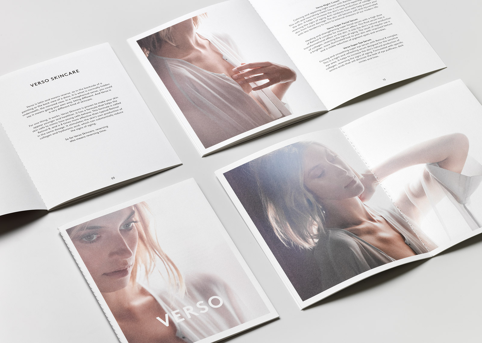
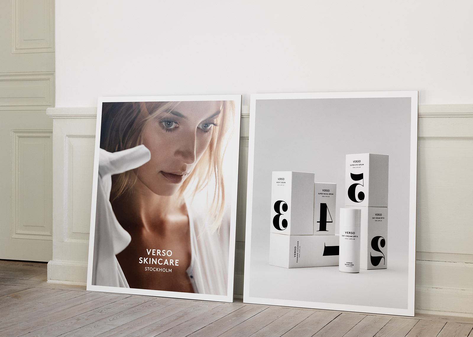
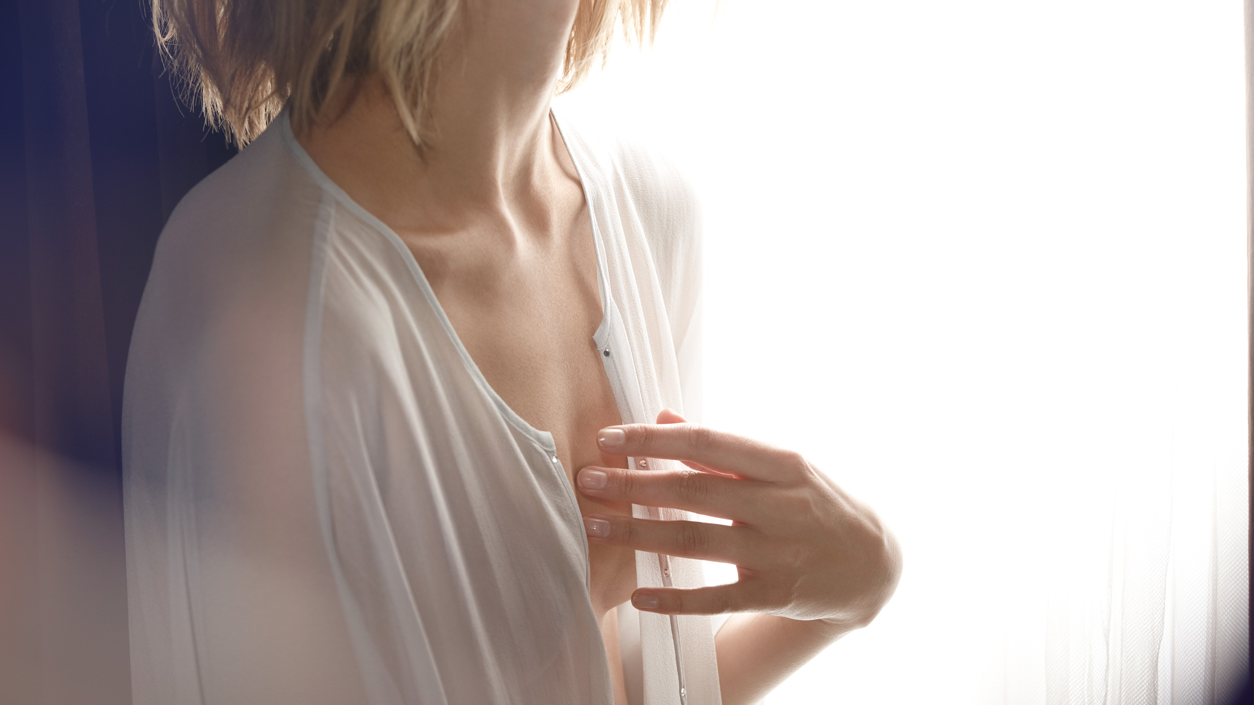
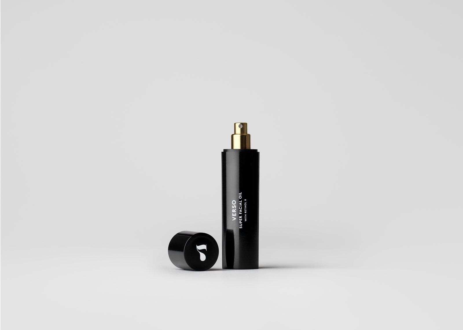
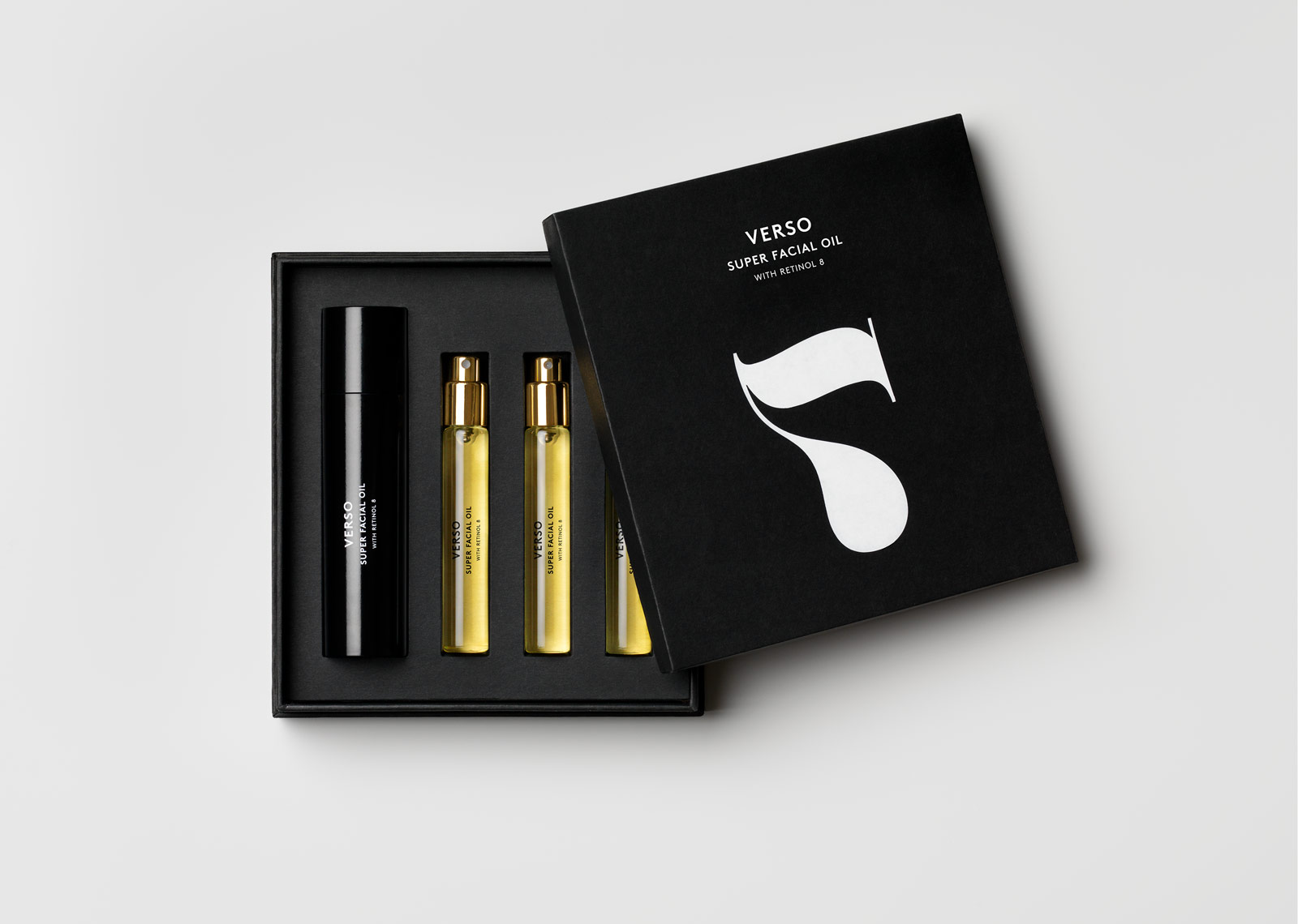
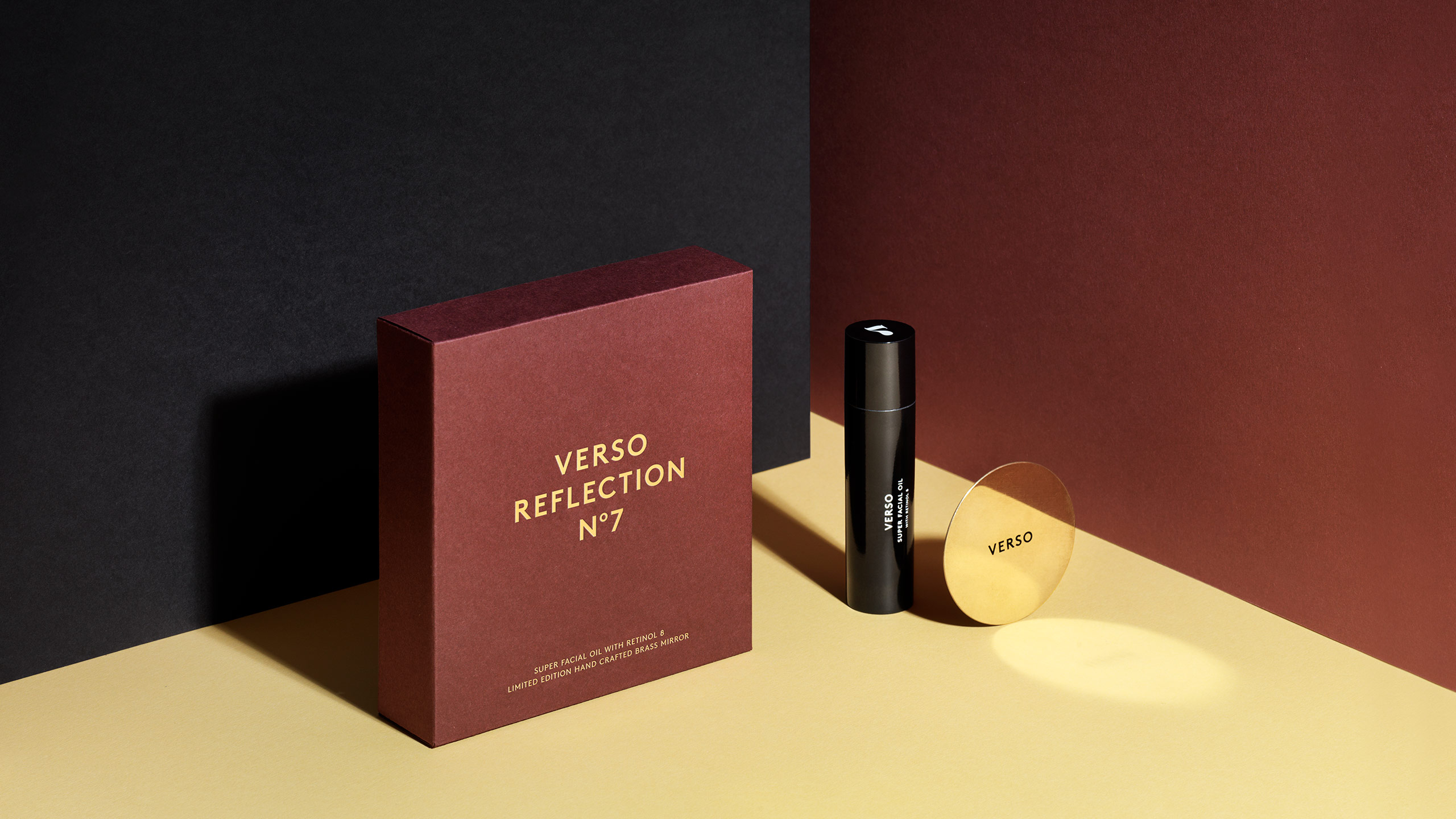
Verso Skincare
Verso Skincare was founded by skincare expert Lars Fredriksson of Selego in Stockholm, Sweden. The active ingredient in Verso is a patented Vitamin A substance called Retinol 8, which is eight times more potent than regular retinol and clinically tested for safety and efficacy at the world-renowned Karolinska University Hospital. Retinol stimulates the skin cells’ own production of collagen, and helps to reduce fine lines and other signs of ageing. When Lars approached The Studio, the brief was simple – yet the problem complex. The highly competitive skincare and beauty market is dominated by a handful of global giants with enormous resources for marketing and product development. Lars had none of that. So the challenge was to develop a concept, a name and a design, so strong that it would establish a presence on the market without massive advertising efforts.
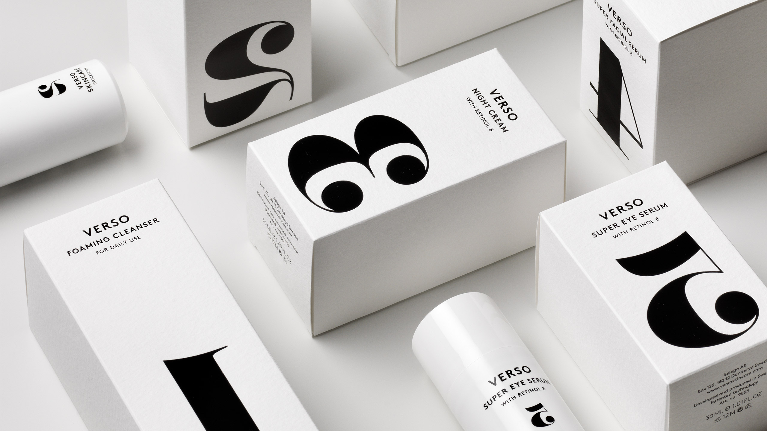
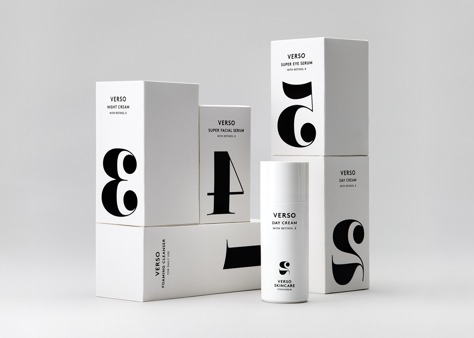
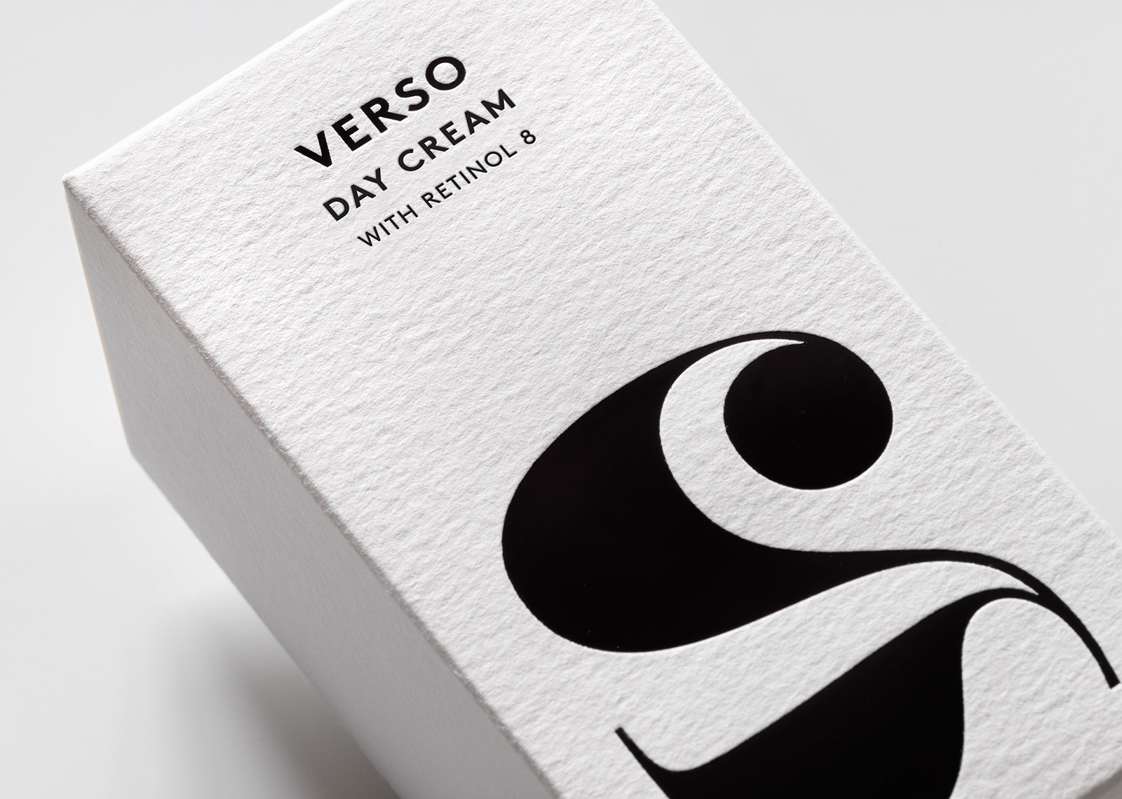
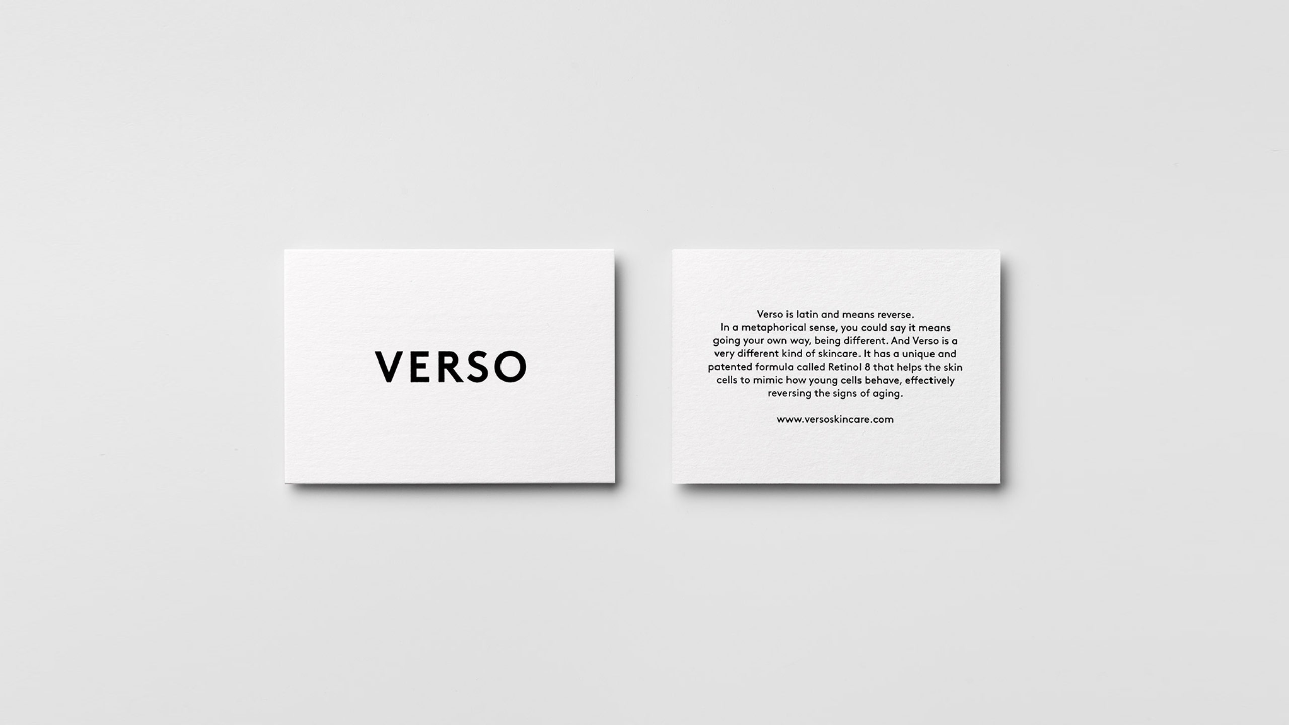
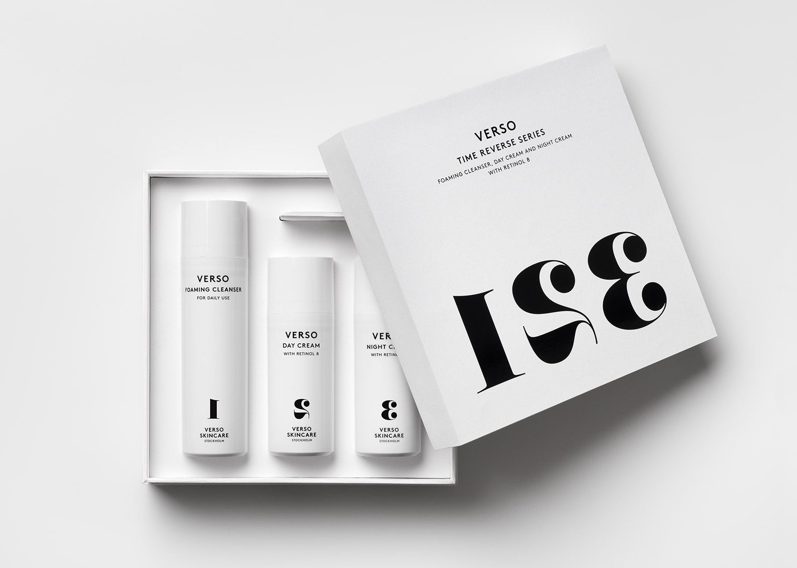
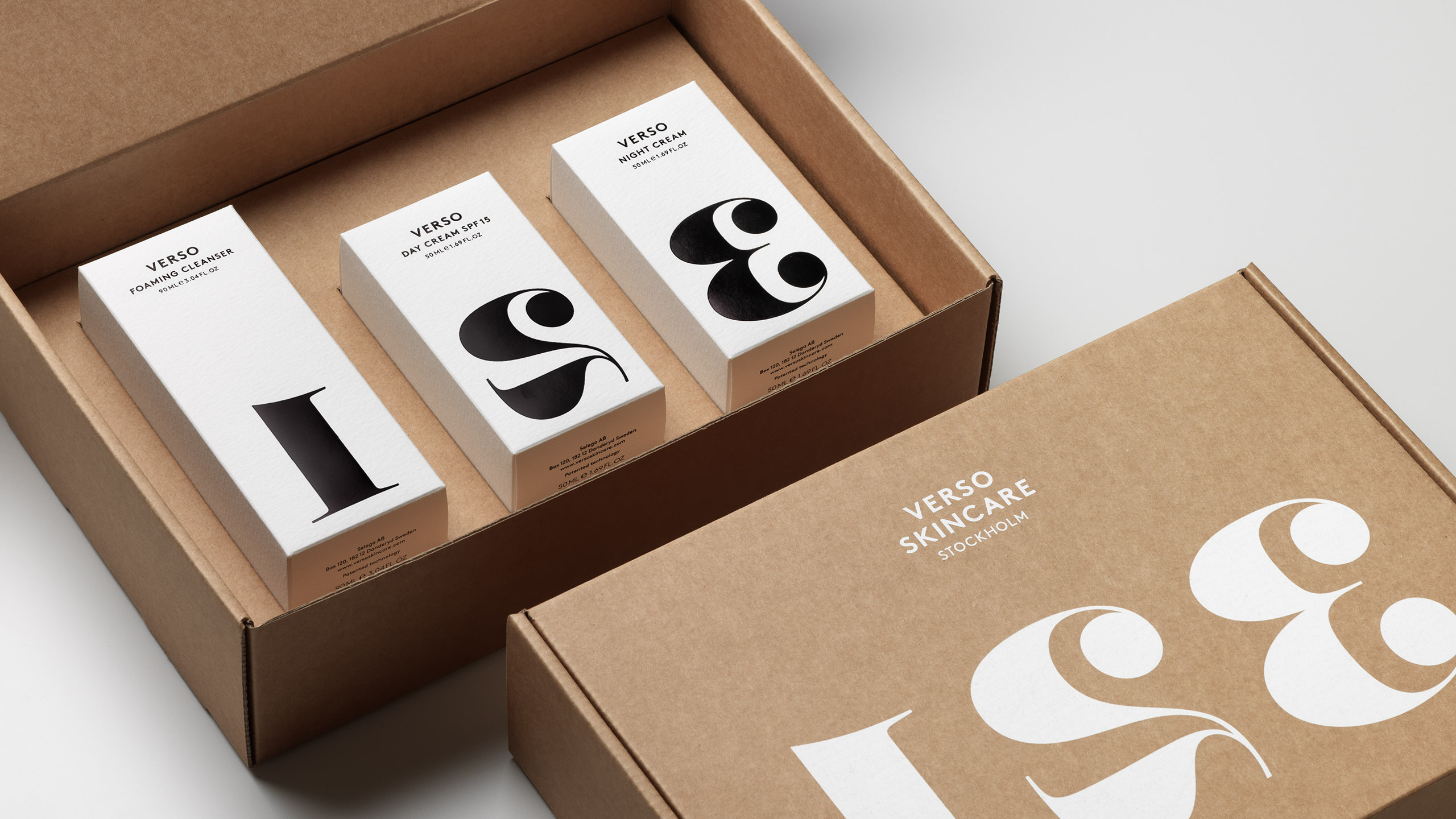
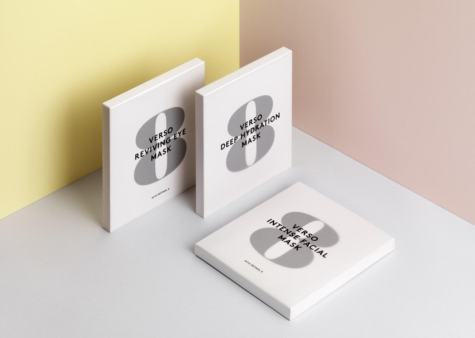
The name Verso gave meaning to the product line since it is Latin for reverse and refers to the product promise of reversing signs of ageing. The packaging design further expresses this idea through the reversal of the large numerals, which helps to differentiate the products and suggest the order of use. The fine quality watercolour paper and printing techniques are used to add a tactile component to the product experience. The identity, typography, photography, copy tonality and packaging all come together to form a cohesive brand expression in all channels, from print to web and film. The result was the creation of a new premium skincare brand with a lifestyle niche, appealing to the modern woman and man.
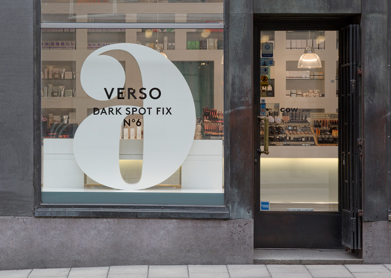
Verso Skincare launched in the spring of 2013 and after only a few months experienced worldwide distribution in some of the finest retail establishments, including Barney’s NY, Selfridges, Net-A-Porter, Sephora and Colette in Paris. The brand gained immediate interest from both print and online media, and has received numerous design awards including the Best of the Best Red Dot Award, D&AD Pencil, One Show N.Y. Silver and Wallpaper Design of the Year nomination.
Case photography: Patrik Lindell